Environmental graphic design
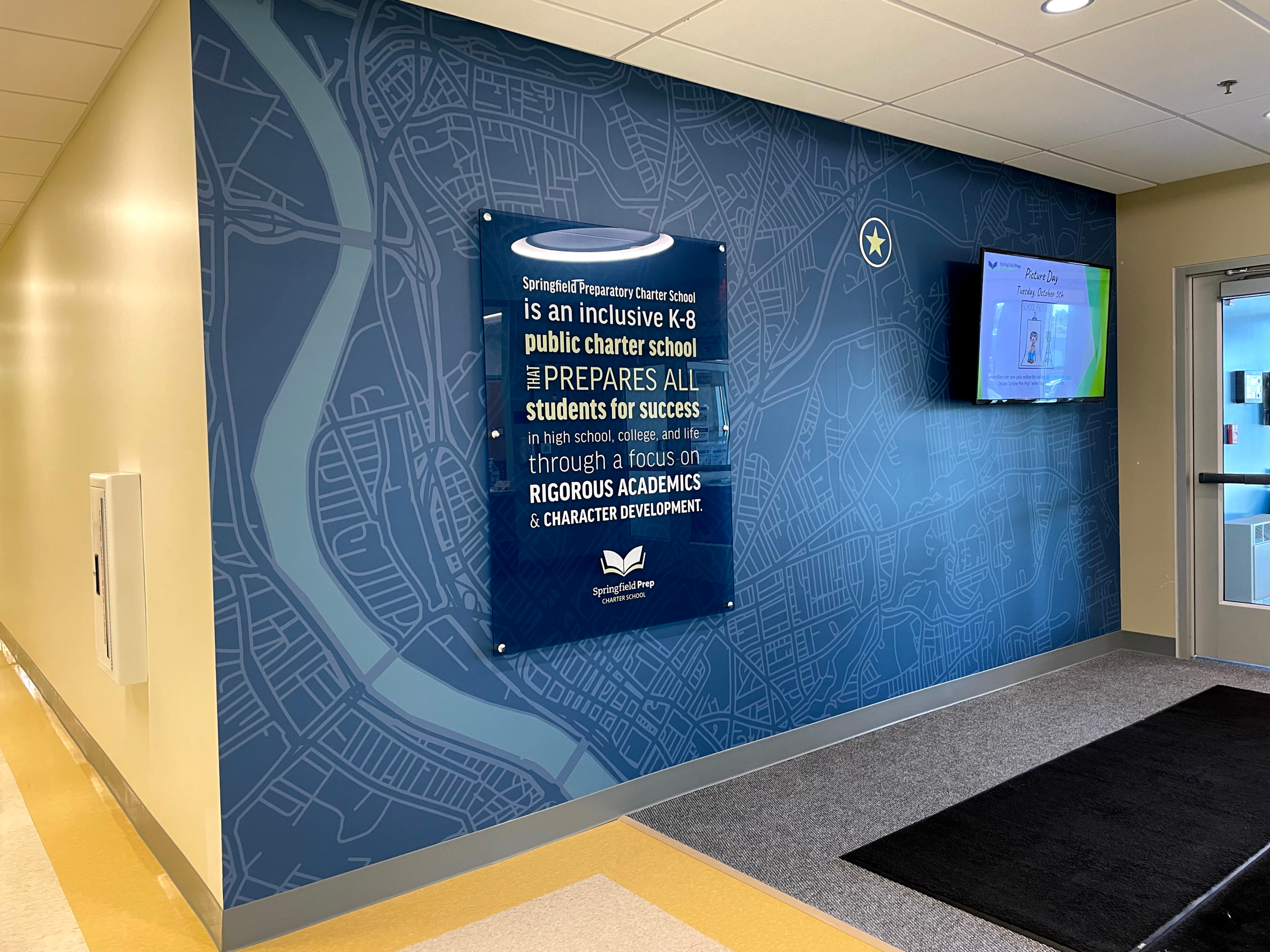
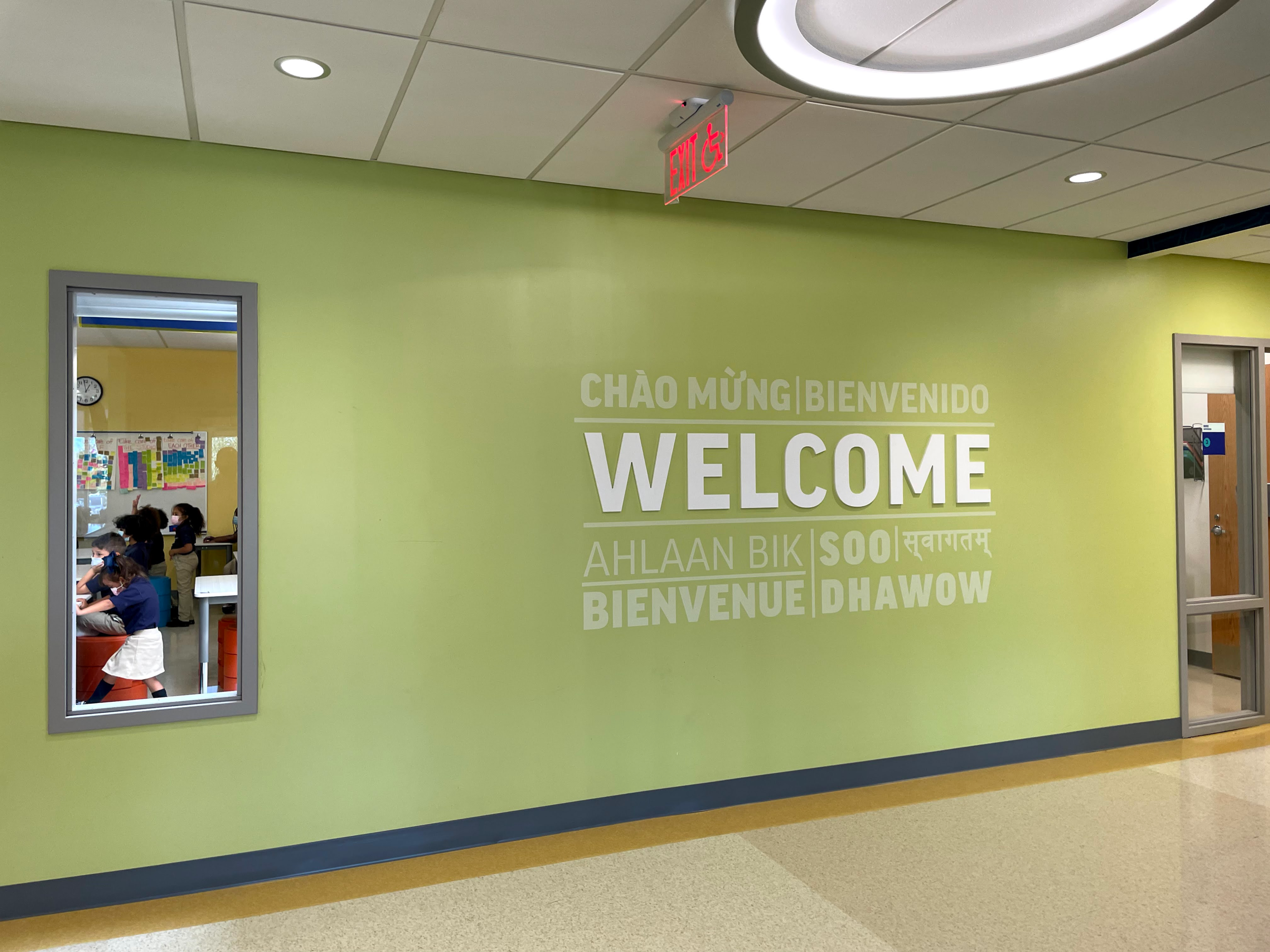
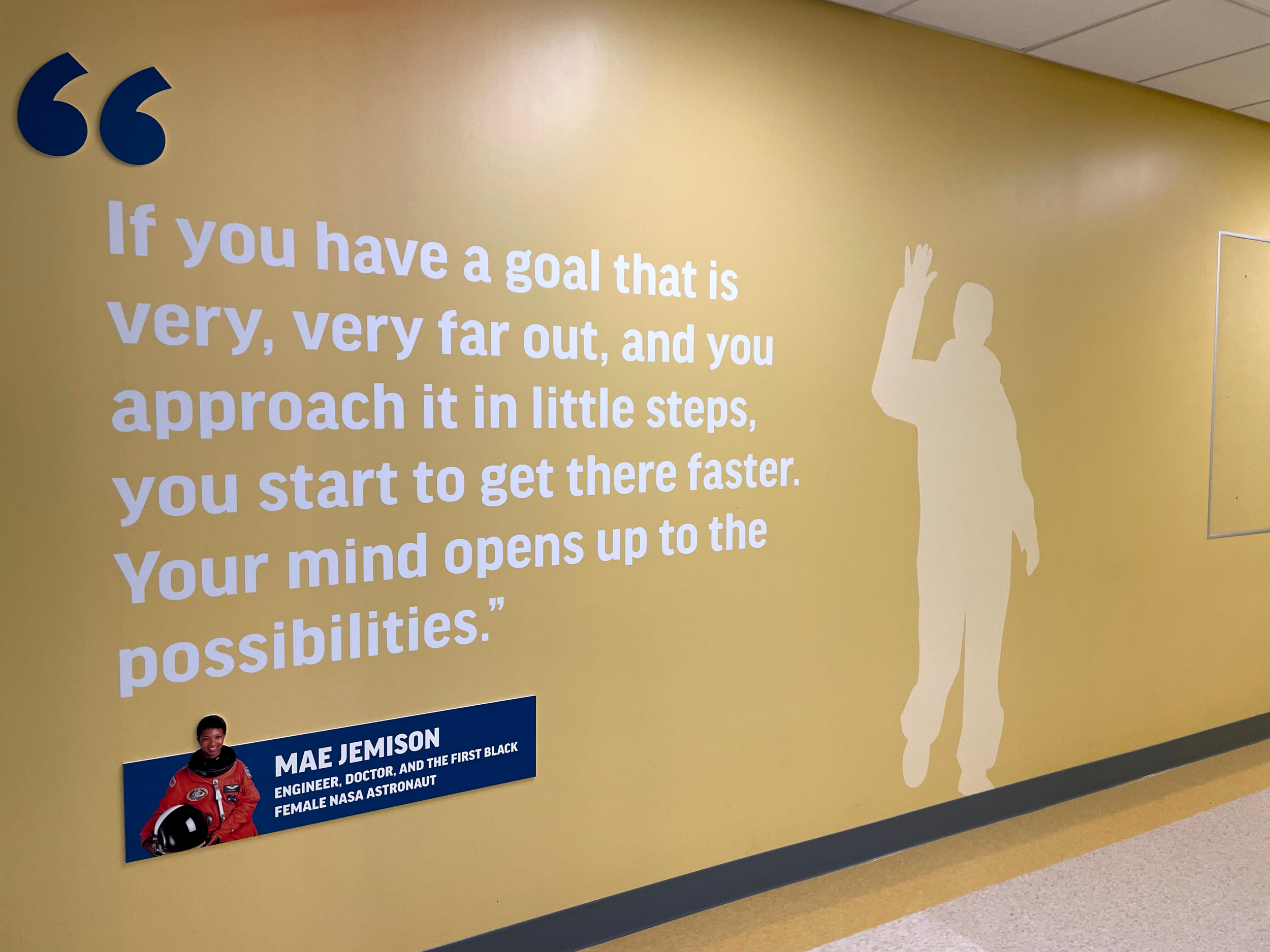
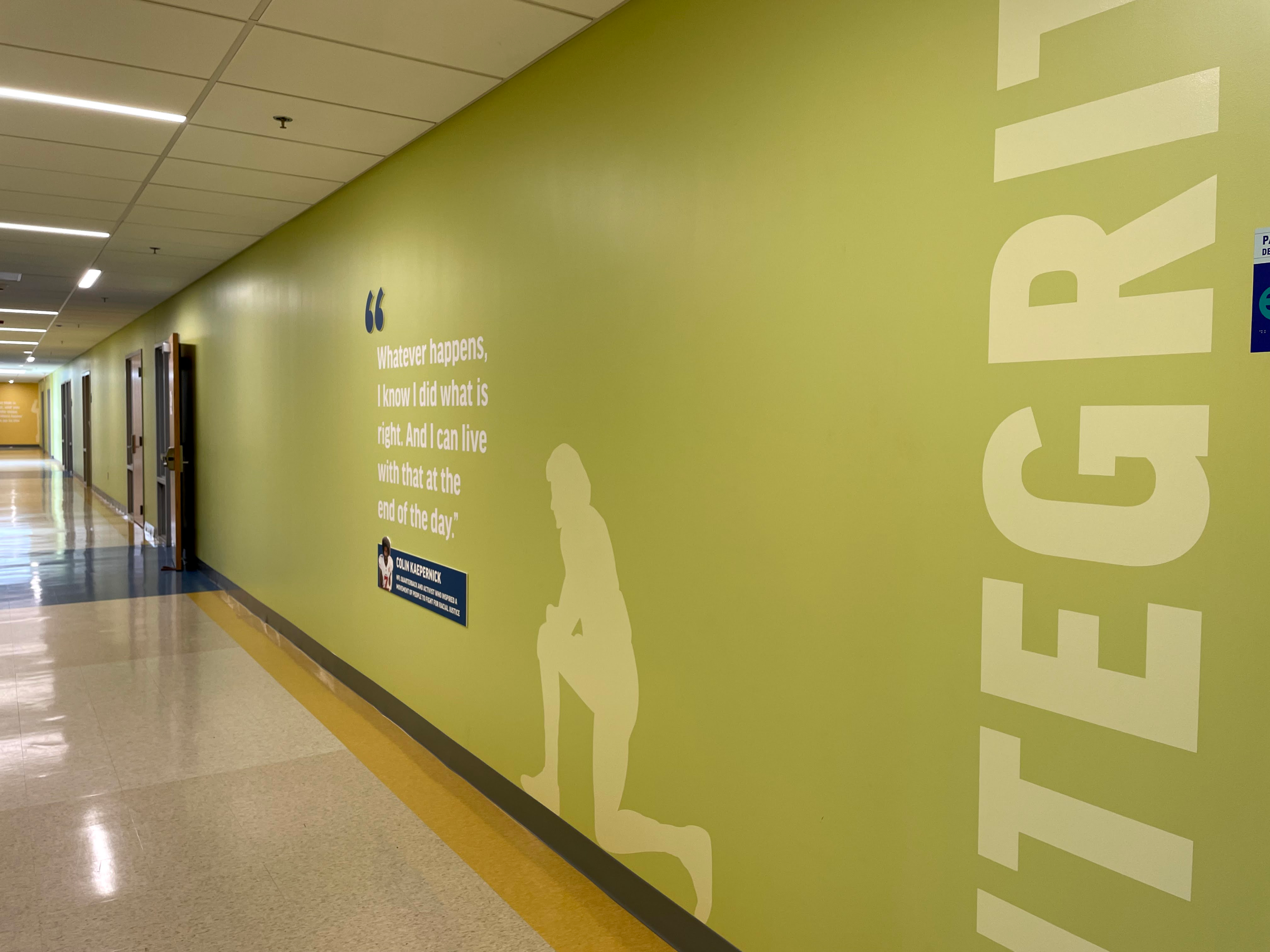
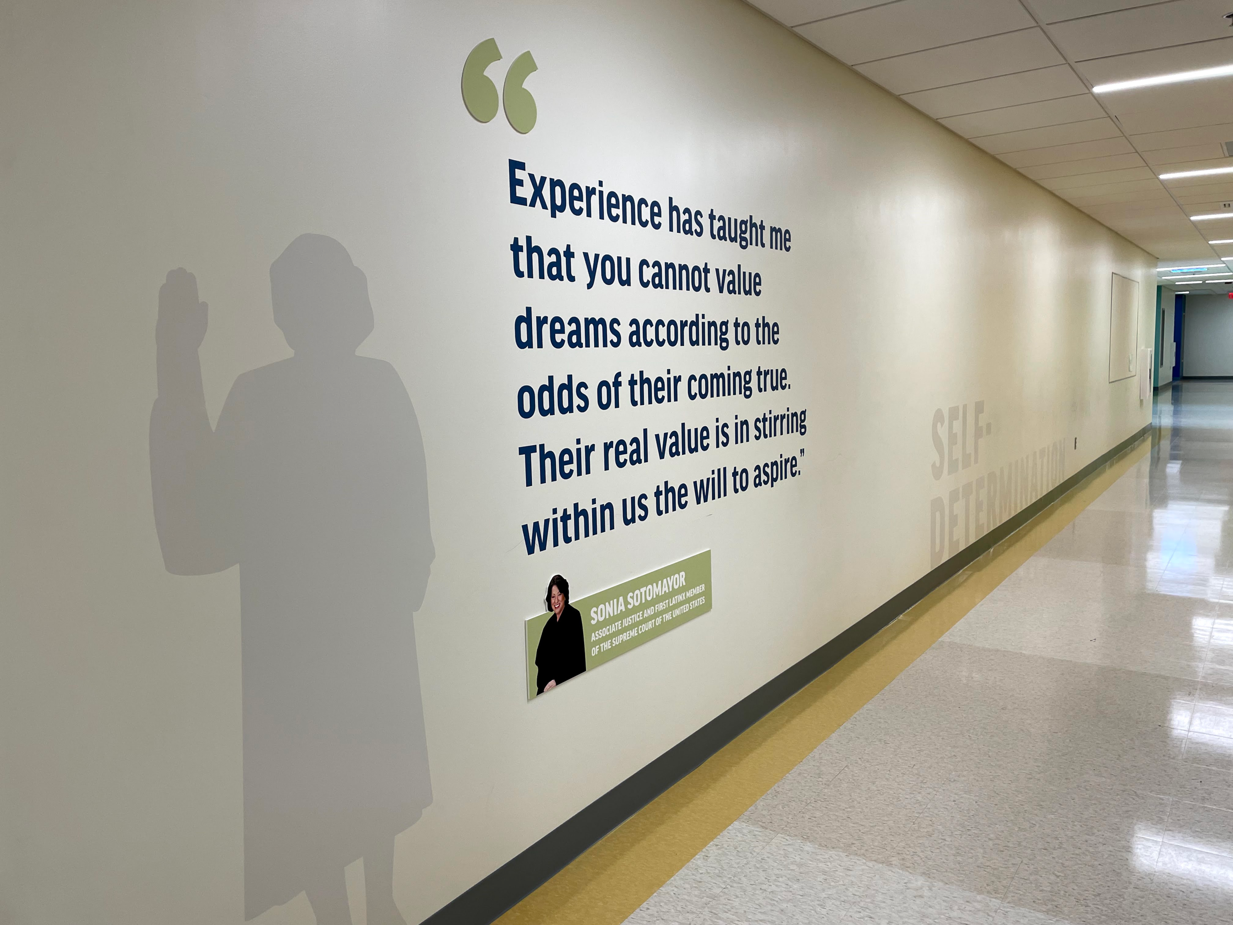
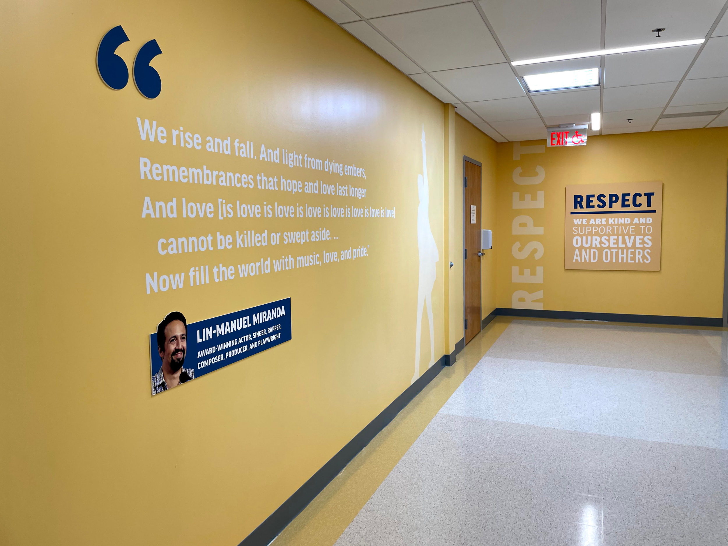
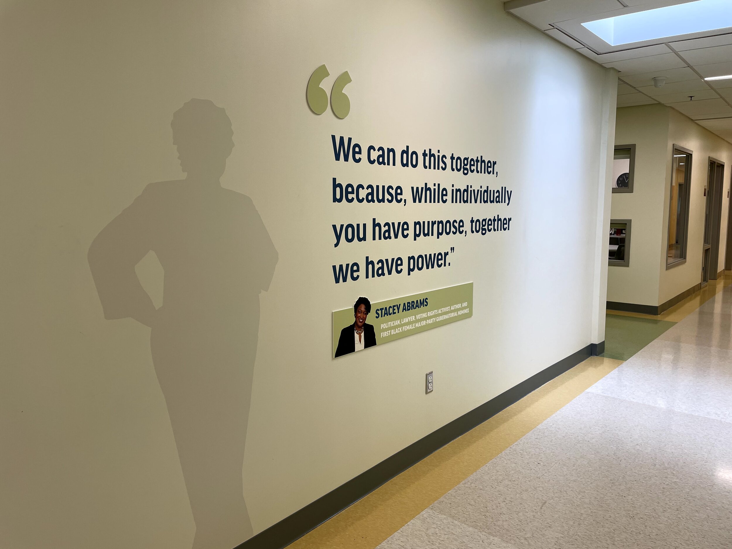
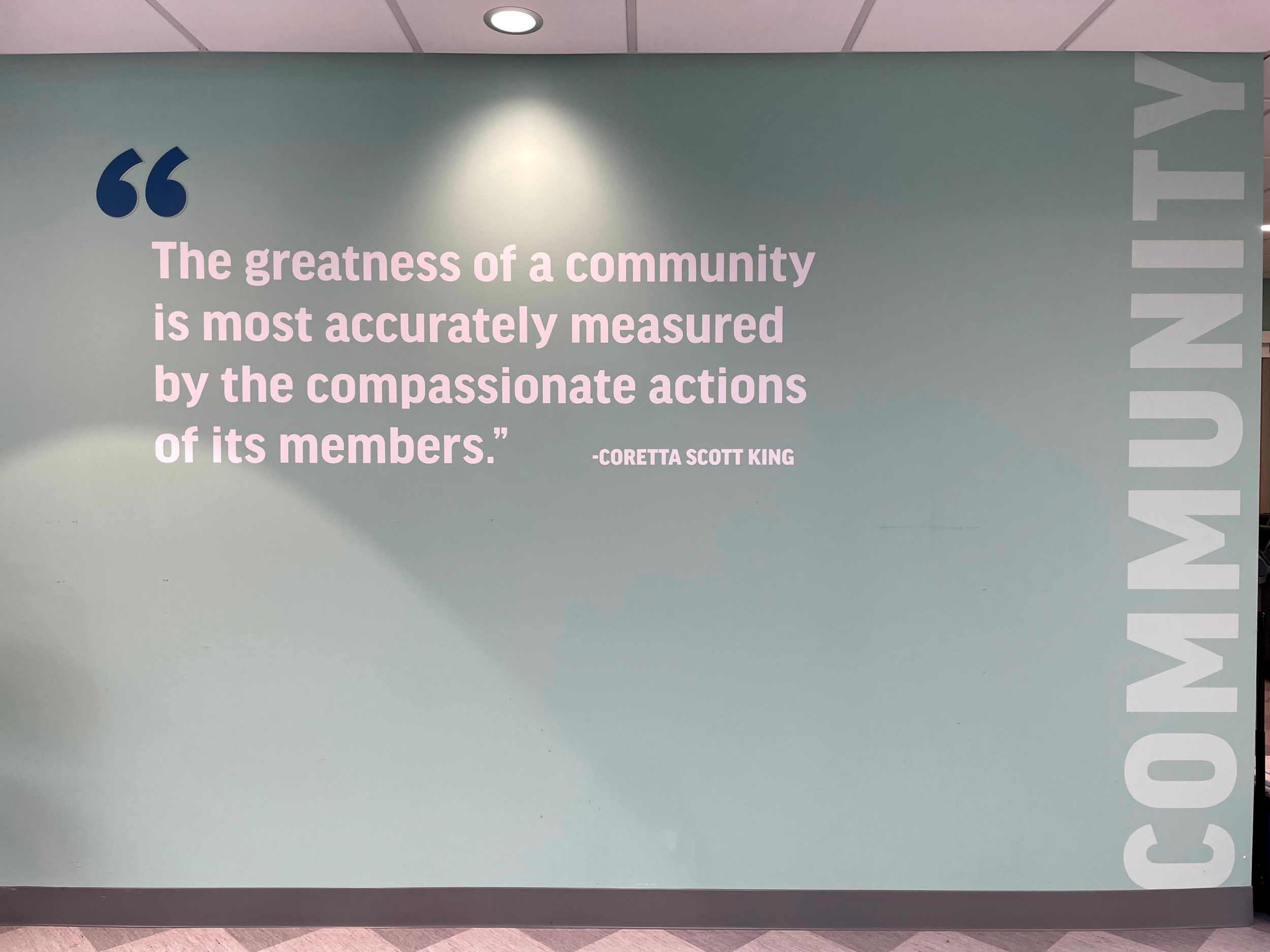
We had the pleasure of working with Springfield Prep Charter School on environmental graphics for their new K–8 campus. We worked with them to conceptualize how the school values, their mission, and quotes from inspirational leaders should be displayed for students, teachers, parents, and staff within the building. In the concept phase, we collaborated with their team on the graphic flow around the school and provided multiple concepts for review. In the design development and production phases, we designed the final graphics and worked with painters and printers to produce the final graphics.
Presenting multiple concepts
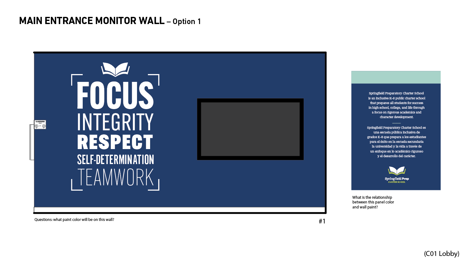
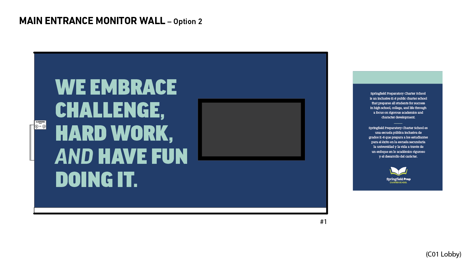
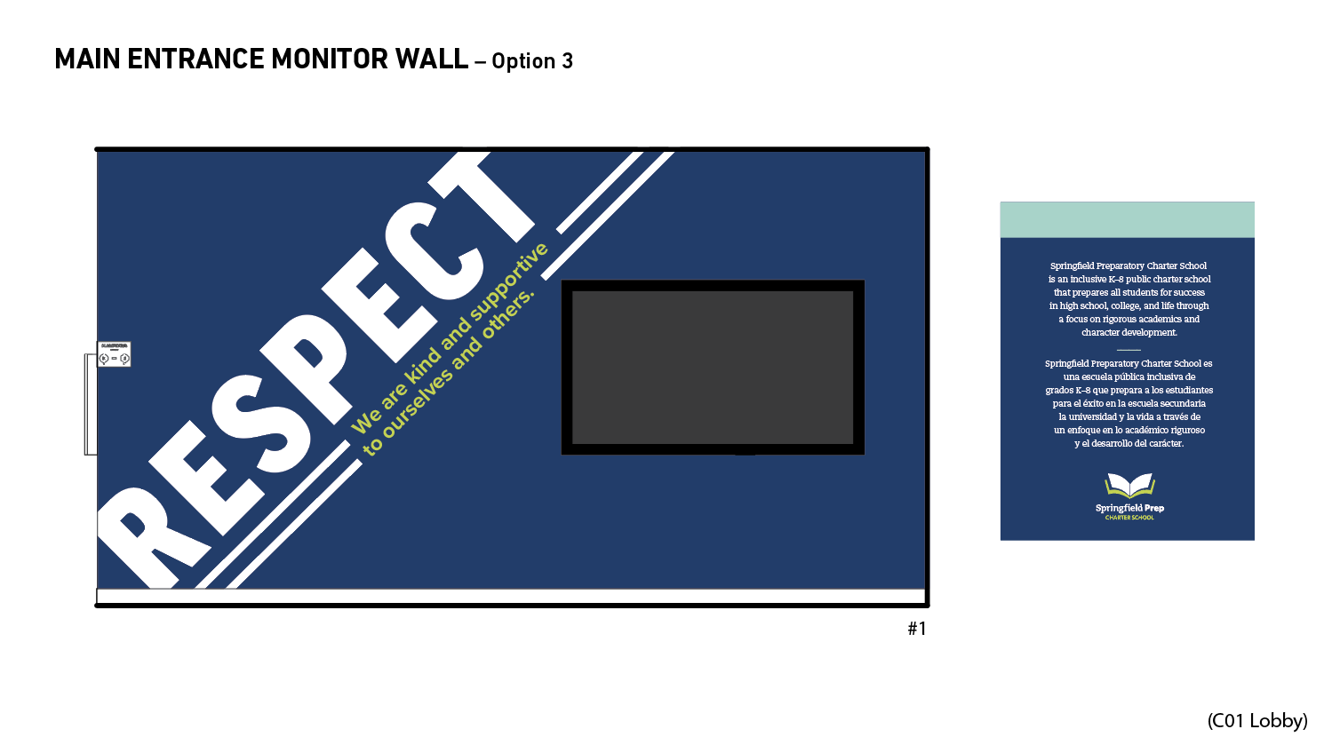
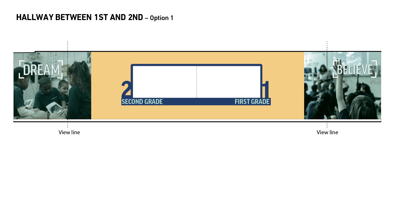
For many of our projects, we present multiple concepts for them to review. This not only allows us to show the different design directions their project can take, but it also allows them to think critically about what exactly they want their project to “say” and what the tone should be. For Springfield Prep we knew that representing their school values as well as inspirational leaders was critical, so all of our concepts highlighted those elements.
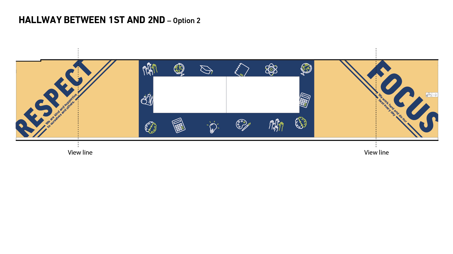
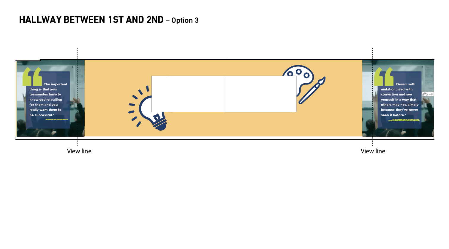
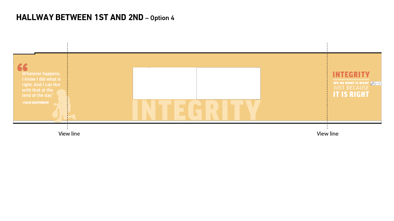

Project Organization support
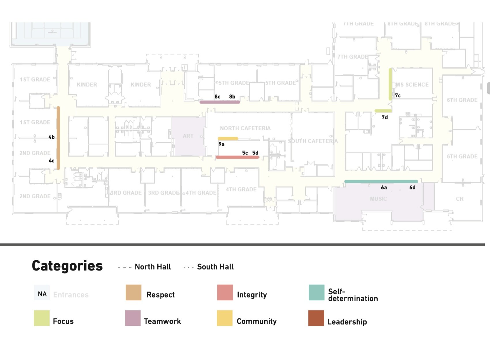
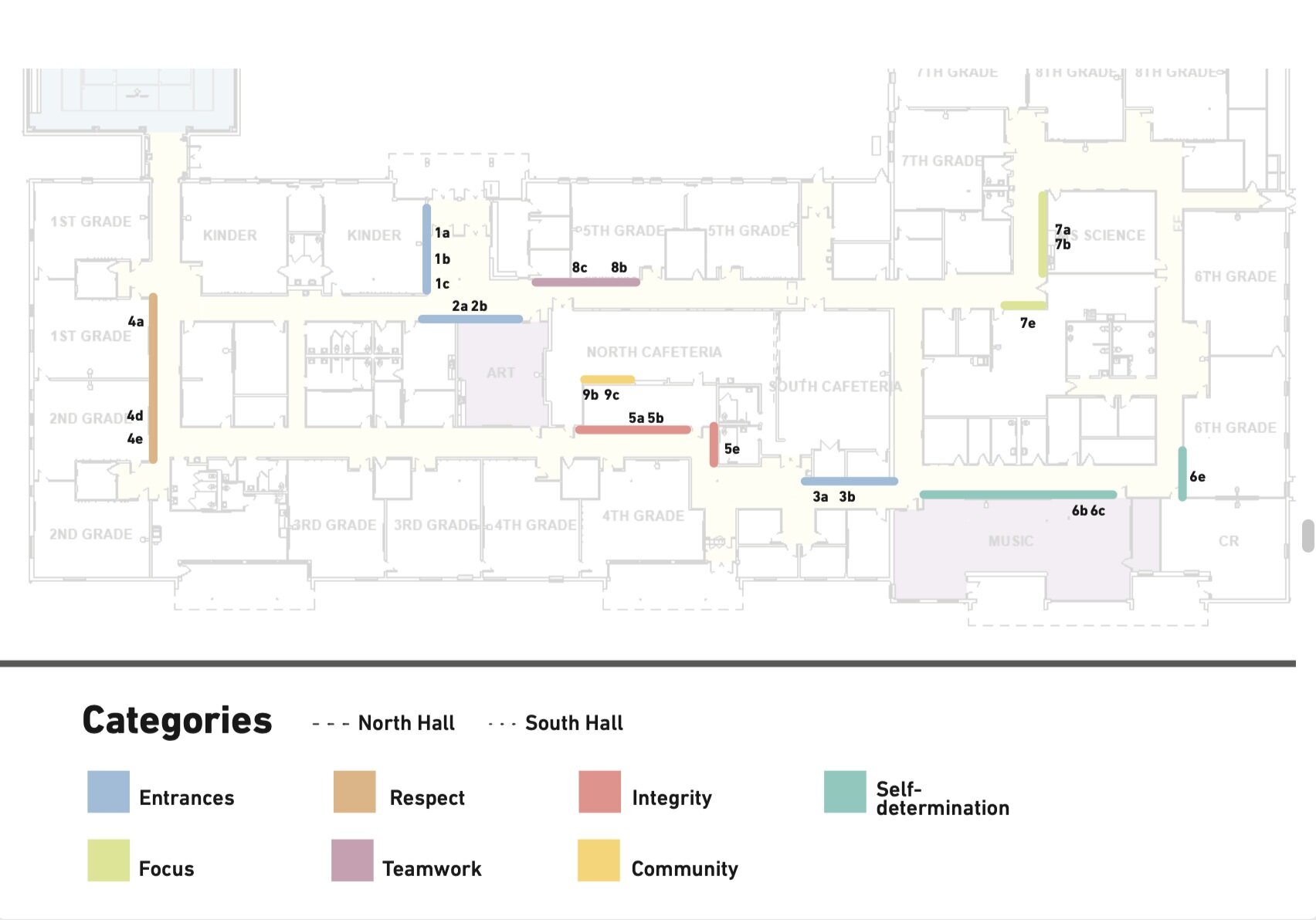
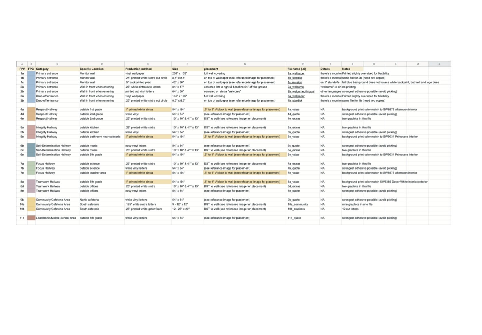
We not only visualize complex information for our clients to communicate to their audiences, but we also help support the production process by creating documents to show how elements are categorized, where they go, their sizes, materials, etc. We use our visualization skills to create these to be user-friendly and clear. Our clients often comment that these really help them to get their whole team on the same page and make sure no details get missed.
Finalizing the design
We started working on this project after the majority of the architectural details, including wall colors, had been selected. We designed our graphics to complement the palette and the school brand colors to ensure that the space was cohesive.
We wanted to have both printed and painted elements. This had two purposes 1) a mixture of textures and dimensions help to draw attention to the graphics, and 2) since this building has young children it we needed to take into consideration longevity. Using painted graphic elements reduces picking and makes for easy cleaning.

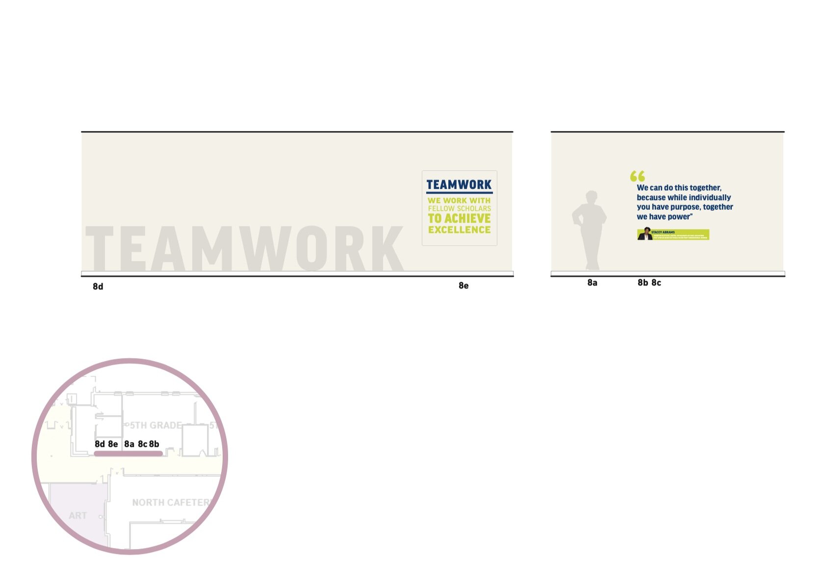
THe final graphics


