Breaking up long narrative text into sections
We designed a booklet of Senior Capstone Engineering projects for Boston University. This project was a challenge because we had a lot of content, and needed to organize it in a way that would make it easy to read and consume. We were lucky to be involved from the beginning of the process so we could be involved in defining how the content should be structured and developed.
Read more below to learn about our process.
Our process
Create a Google survey for the students to fill out that separates out the different types of information, so for example, they write separate short blurbs specifically about the requirements, the problem they are trying to solve, the solution, and the results. Most importantly, we asked them to write a one-sentence overview, knowing that we’d feature this text prominently on the project pages. We also specified what types of images they should provide. This is in contrast to previous years when each team wrote a free-flowing narrative covering all these topics.
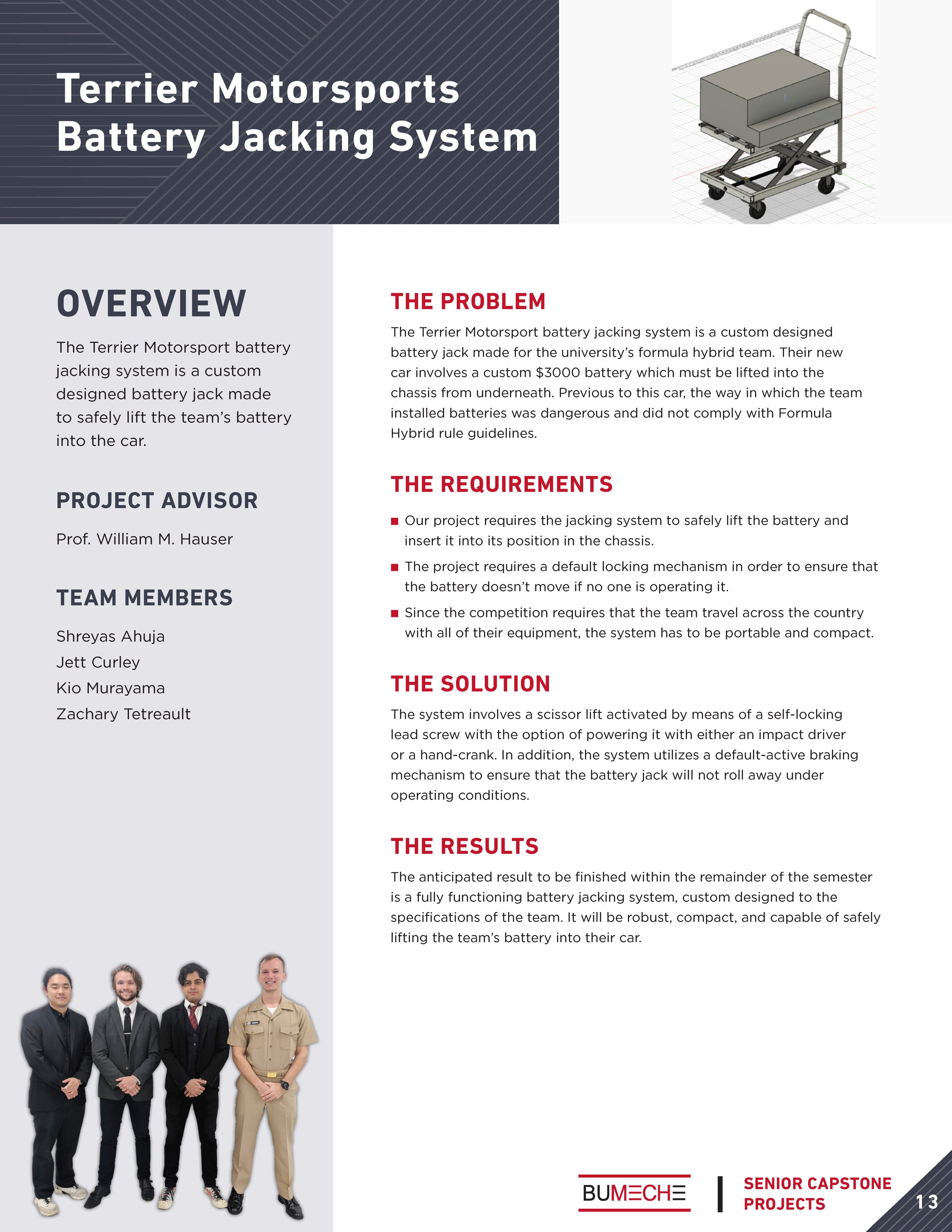
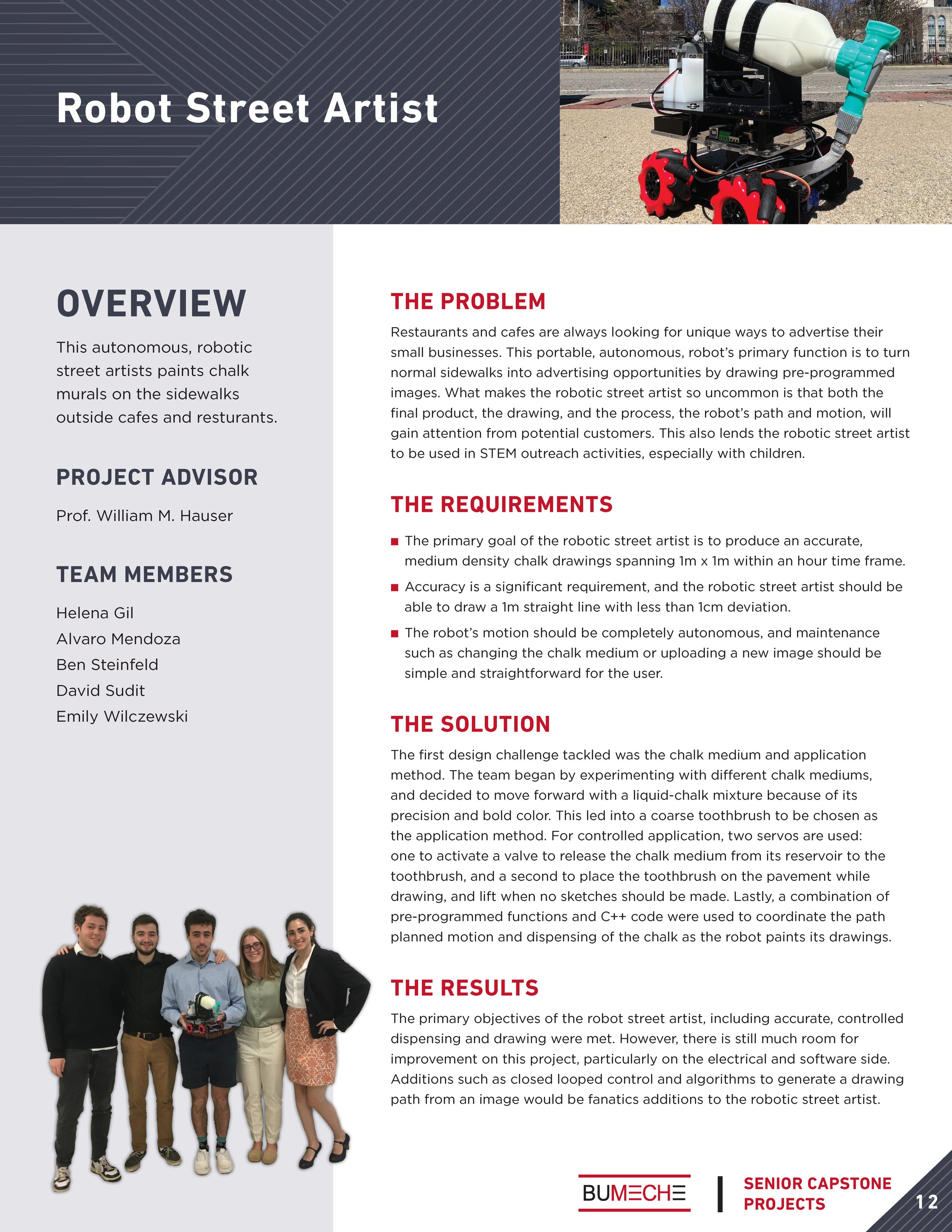
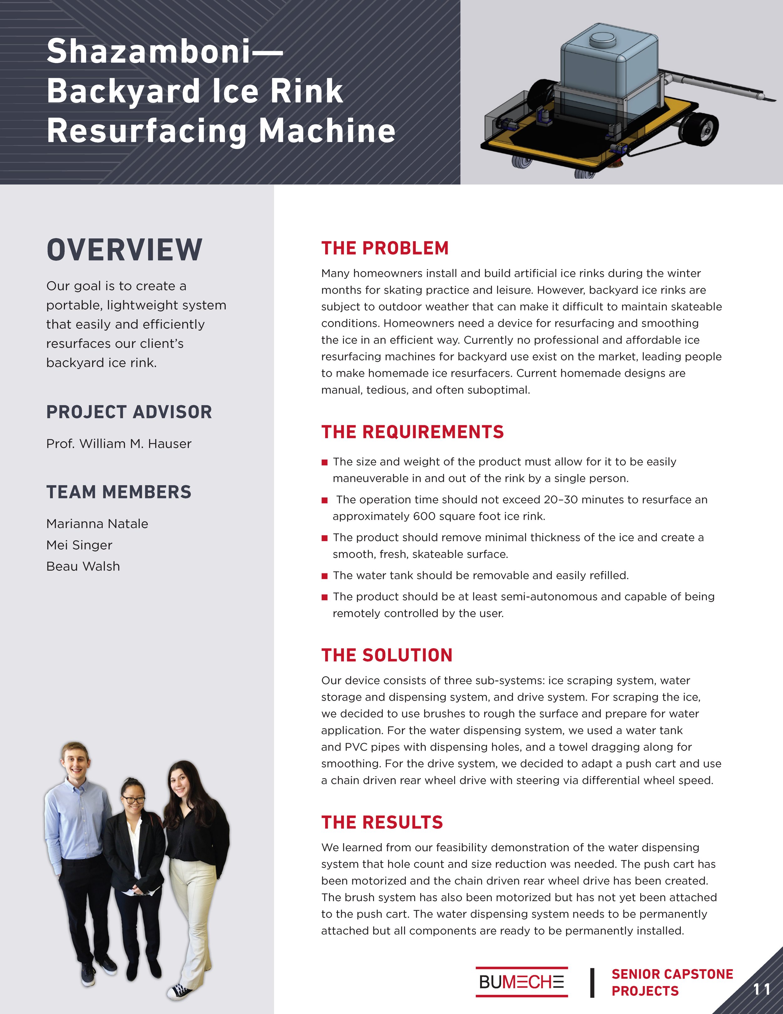
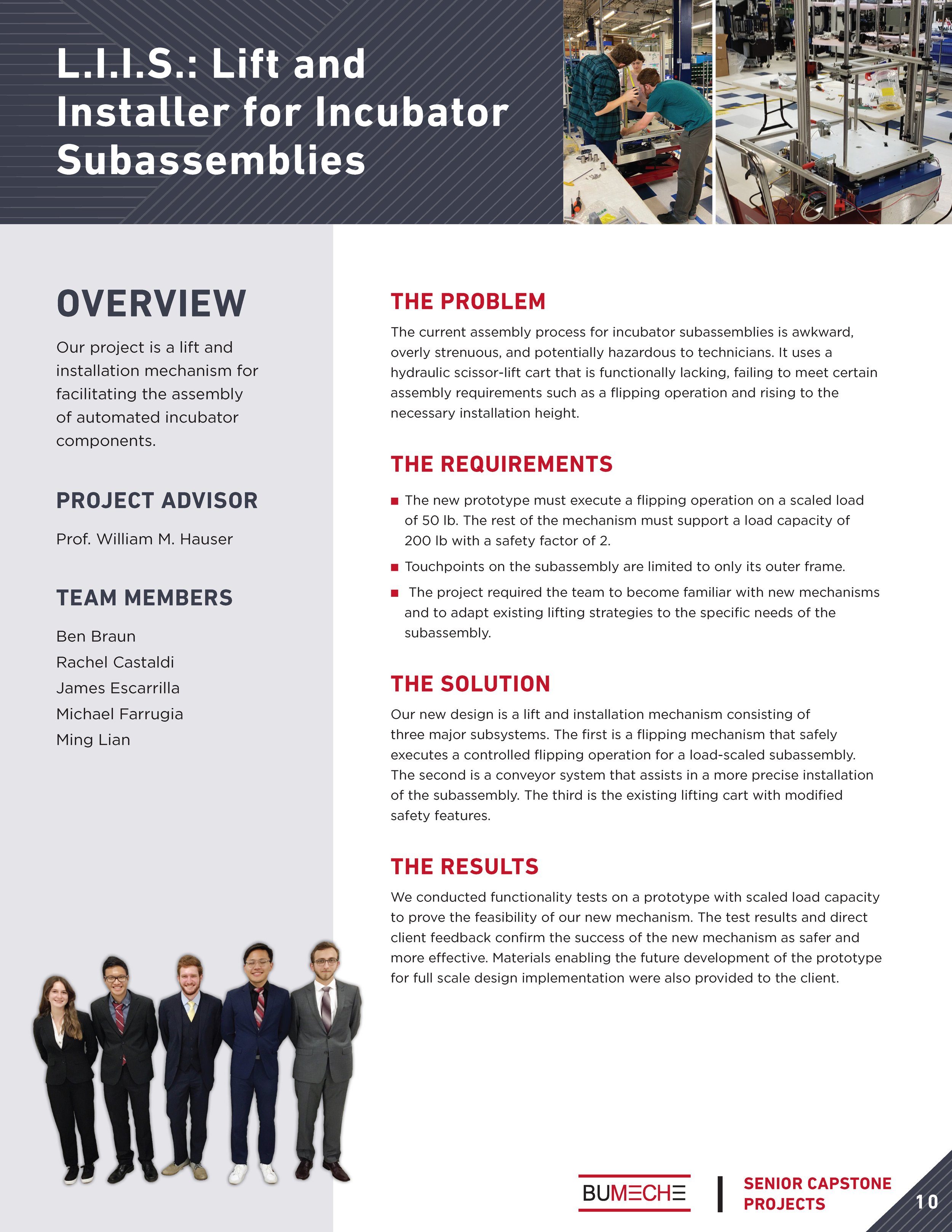
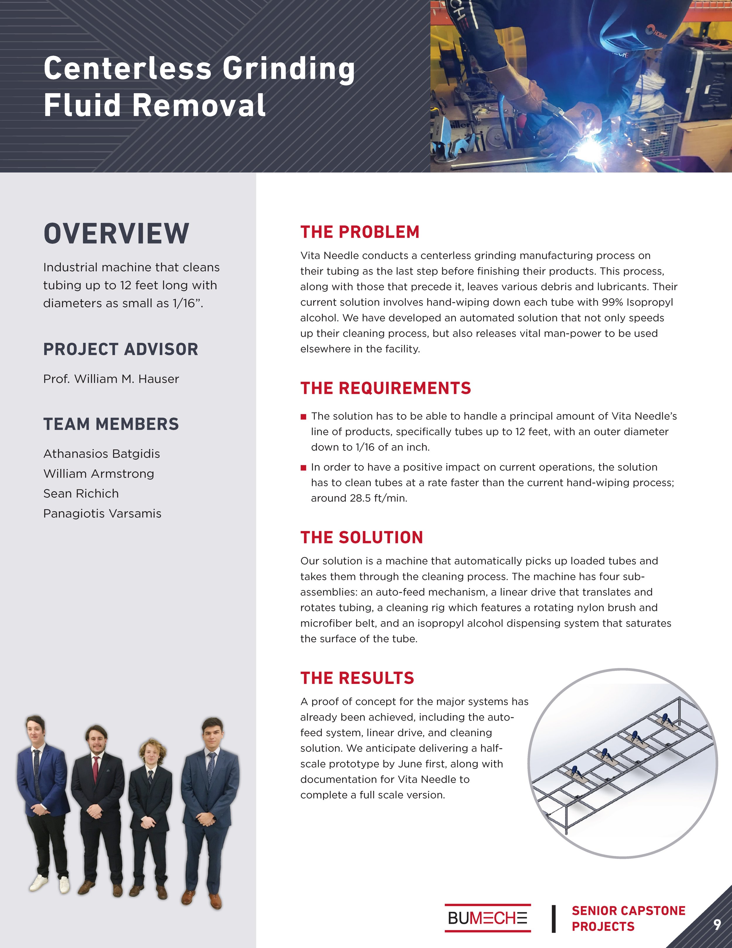
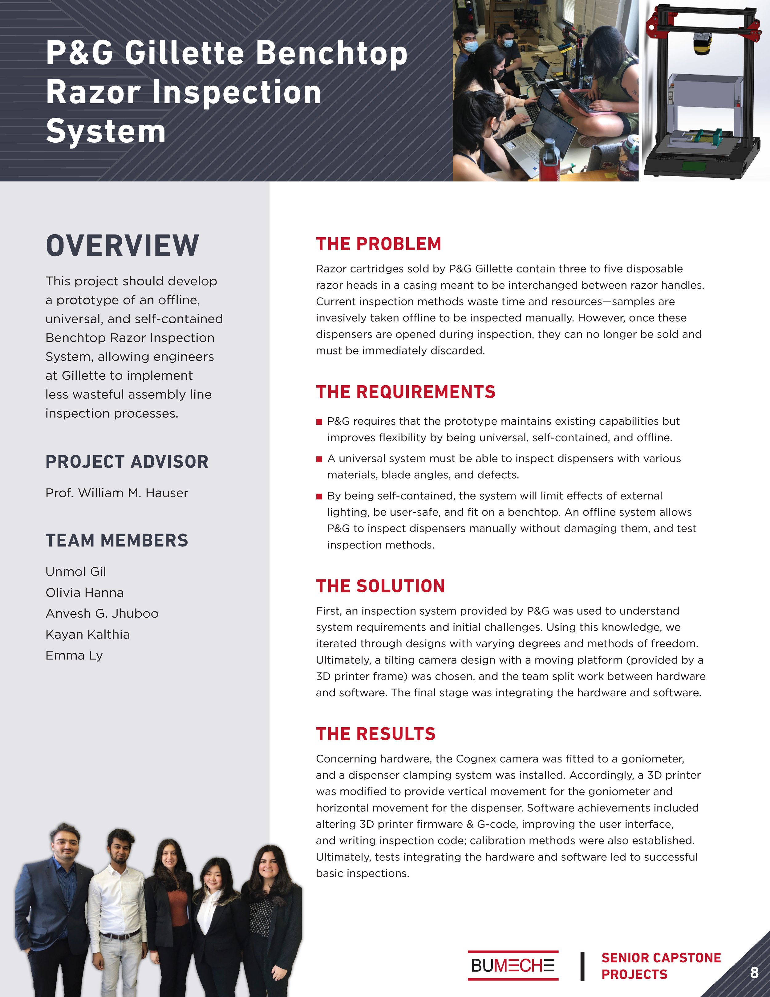
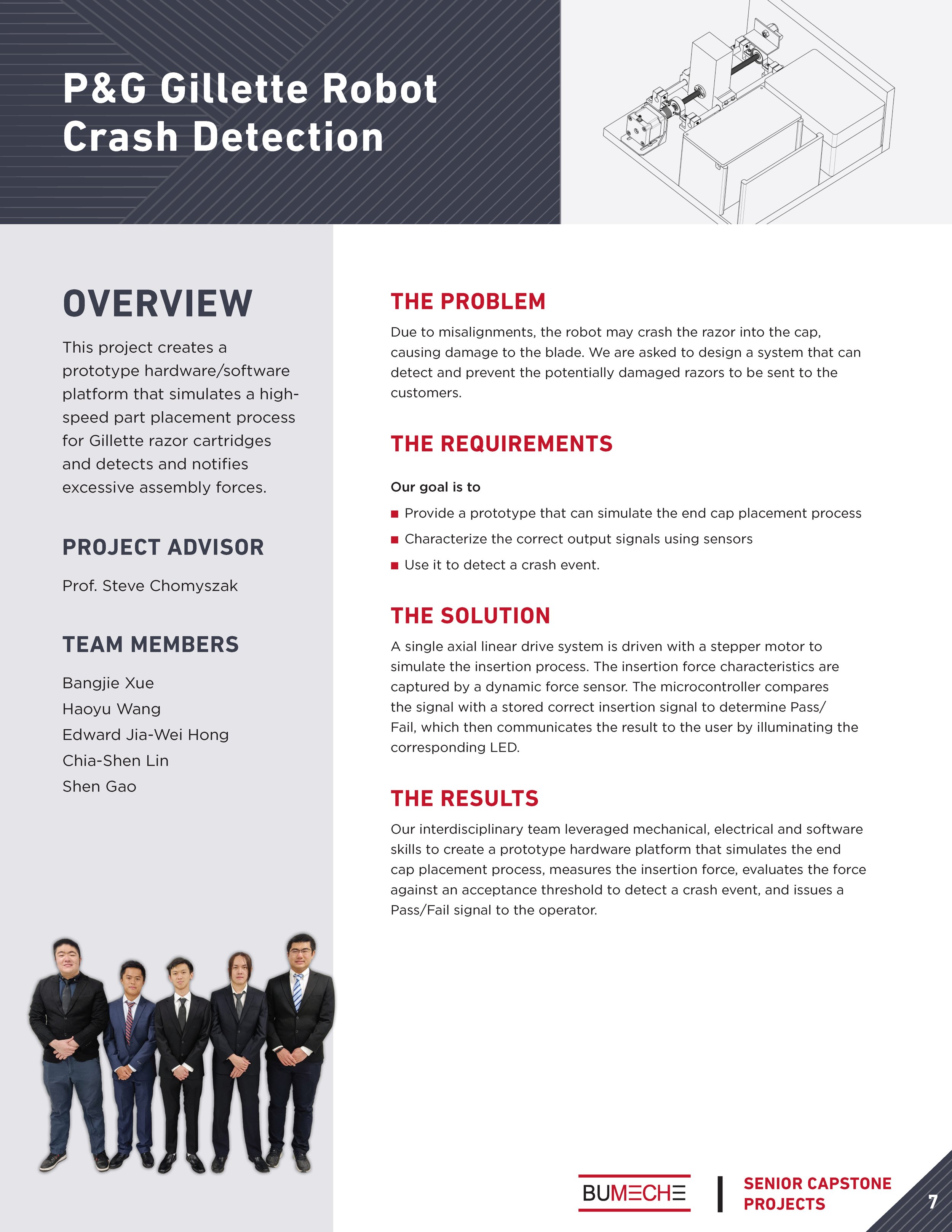
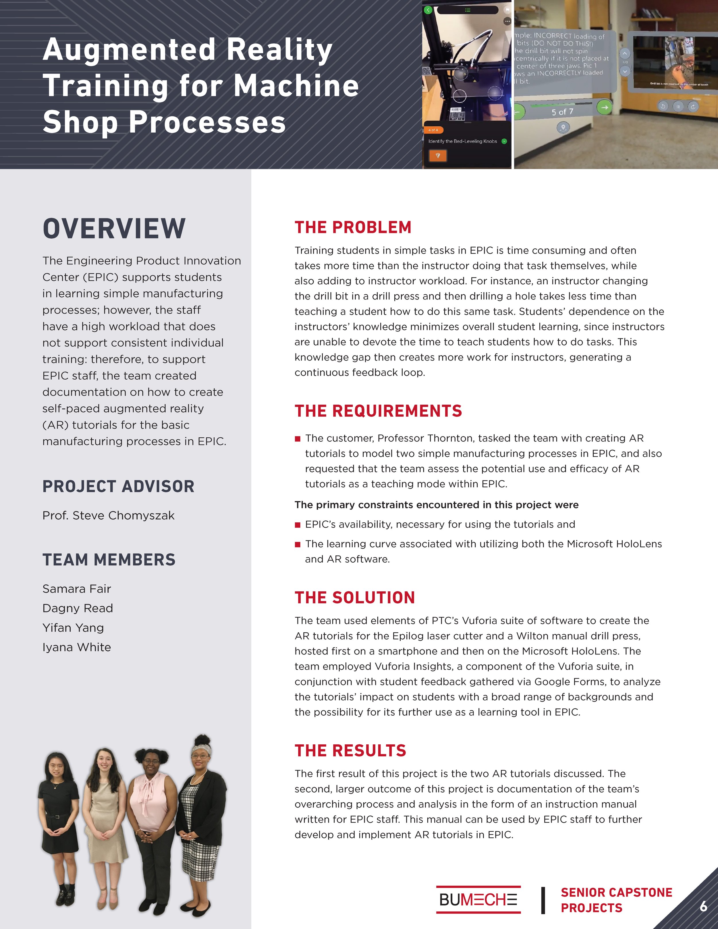
Design a layout that fits these “chunks” of info, featuring the most important text (the overview is bigger and in the sidebar) and appropriately formatting it (for example, the requirements are formatted in bullets).
Using the spreadsheet of info from the surveys, we set up our file in a way that we could quickly do a data merge (nerd alert!) to import the different sections of text into the layout. This saved hours of time as there were 40-ish projects.
We edited the photos, fine-tuned the layouts, and created the additional supporting pages to make sure everything looked good and consistent – and voila a finished booklet!
The survey we designed to collect information/content from the students.
Initial Layout Mockups
We experimented with different layouts using the sections we knew we were working with. We ultimately used a version similar to the first one below. As you can see, the colors are placeholder at this point as we know that the “stylizing” can happen towards the end once we have the basic layout/organization down.

Final Project Pages—
no more “wall of text”
As in all the projects we do, we strive to avoid the “wall of text” by…
Creating a clear hierarchy.
Creating a consistent layout across pages so the reader can learn to expect where to find a particular type of information.
Using succinct and descriptive headers and subheads to assist in scanning.
Designing the layout to reflect the level of importance of each section and the order in which they should be read if there is a narrative arc.
Formatting text in specific ways (like bullets or list form) when possible and appropriate.
Complete Document


