Rethinking Health System Design
We collaborated with the Center for Health Law and Policy Innovation (CHLPI) at Harvard to create this one-pager describing how the Health System is not set up to effectively integrate non-medical health interventions such as food, housing, and transportation supports.
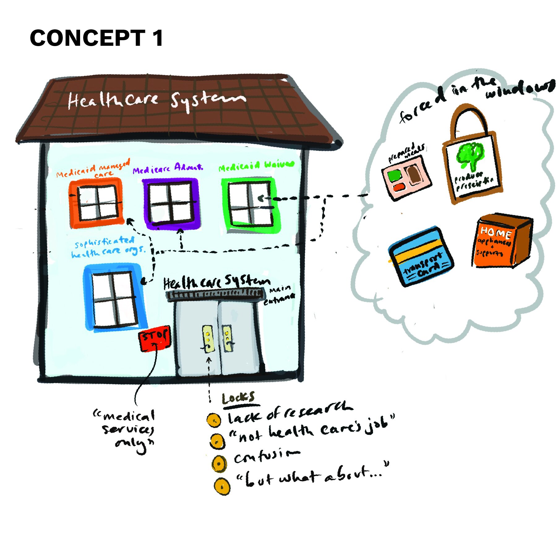
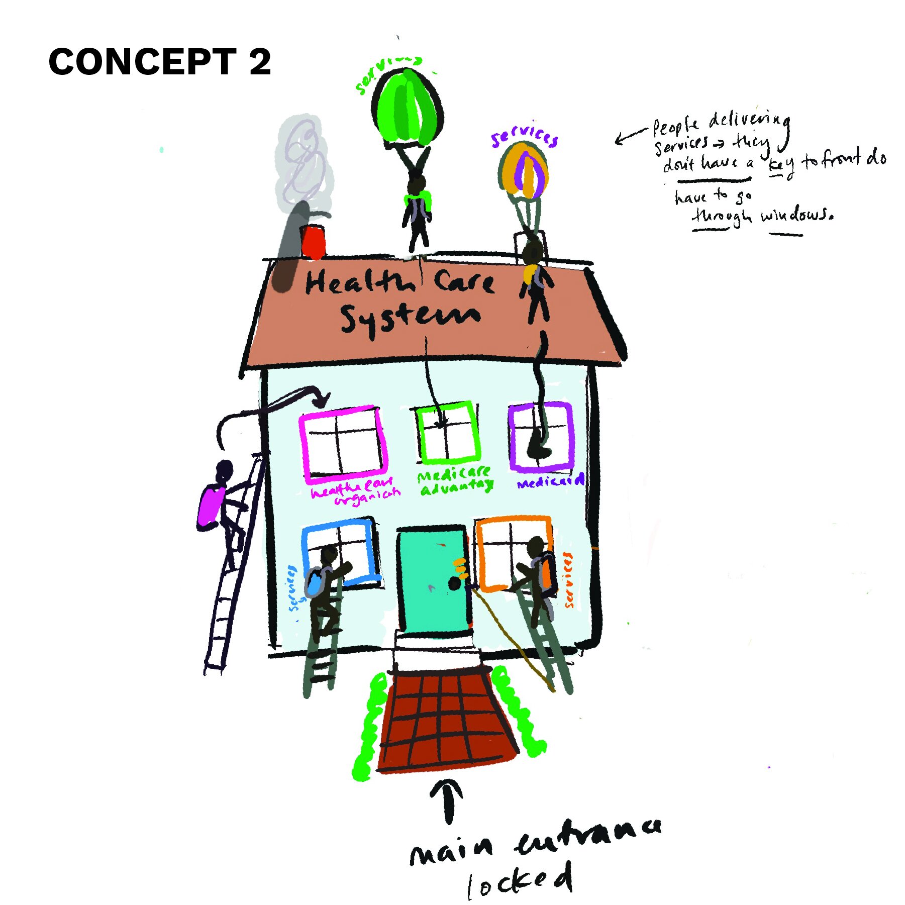
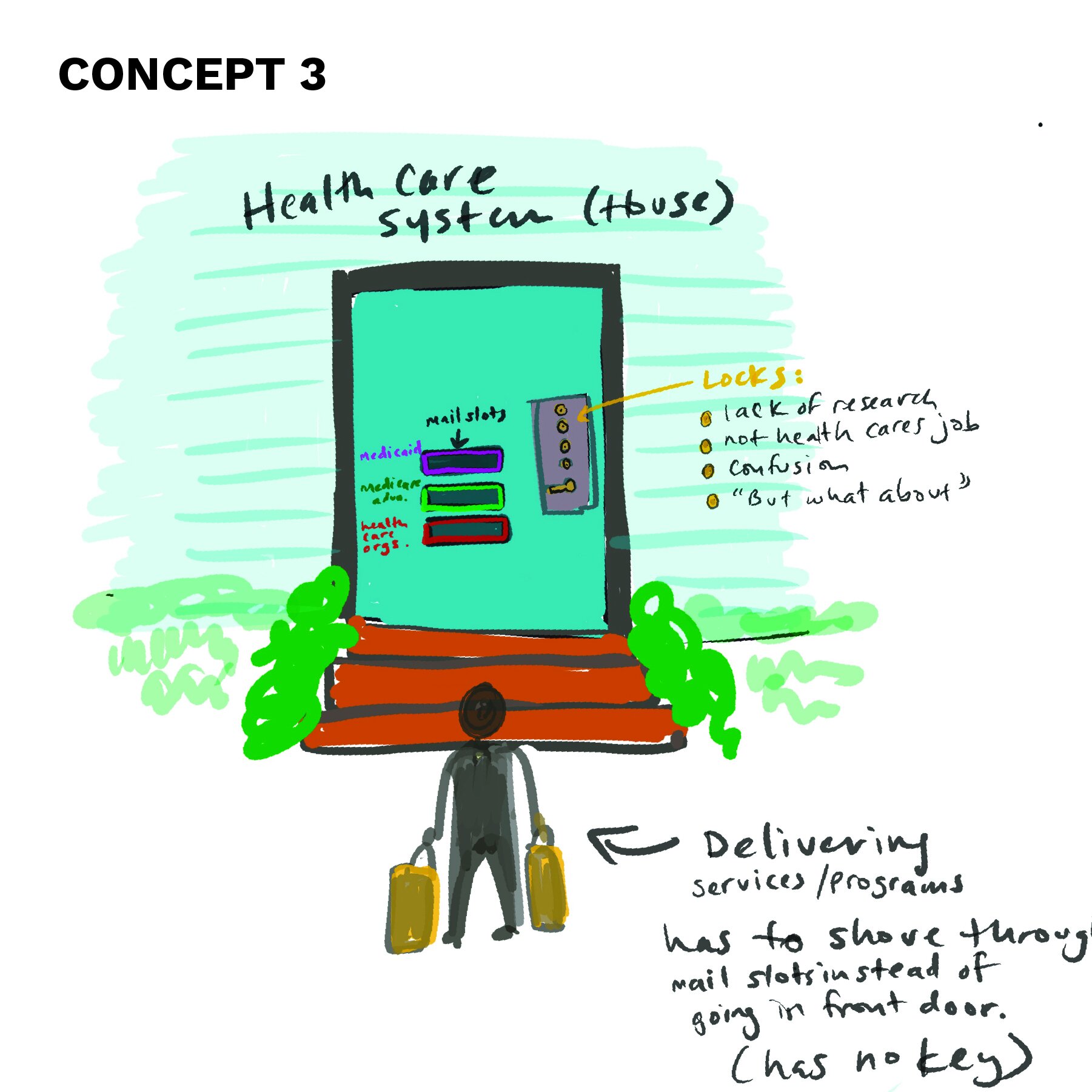
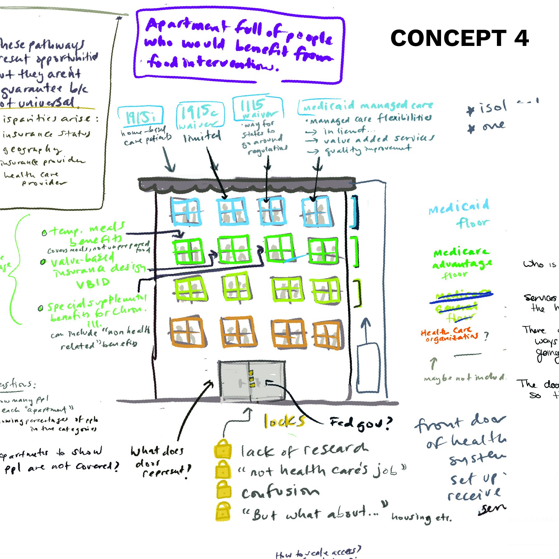
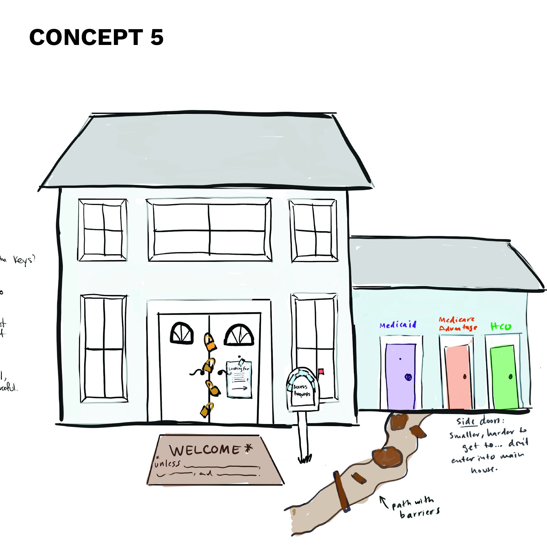
CHLPI was committed to using a house as a metaphor for the health care system–so we brainstormed ways of making that work. (See our initial concept sketches below).
Our final design solution
The main entrance represents the way that medical interventions and treatments are incorporated into the system.
The locks on the main entrance are labeled as the excuses why these health interventions are not “allowed in the main entrance.”
The windows represent the work-around ways that these interventions and services are allowed in, but not in an ideal or equitable way.
For the house illustration, we simplified it as much as possible to make sure it didn’t distract from the content. We used labeling and color-coding around the windows to clearly connect them to the bulleted list below. The interventions are represented in the cloud and point to the windows making it clear that the different interventions go through all of the programs.

