Art Bridges Foundation Traveling Exhibitions Report
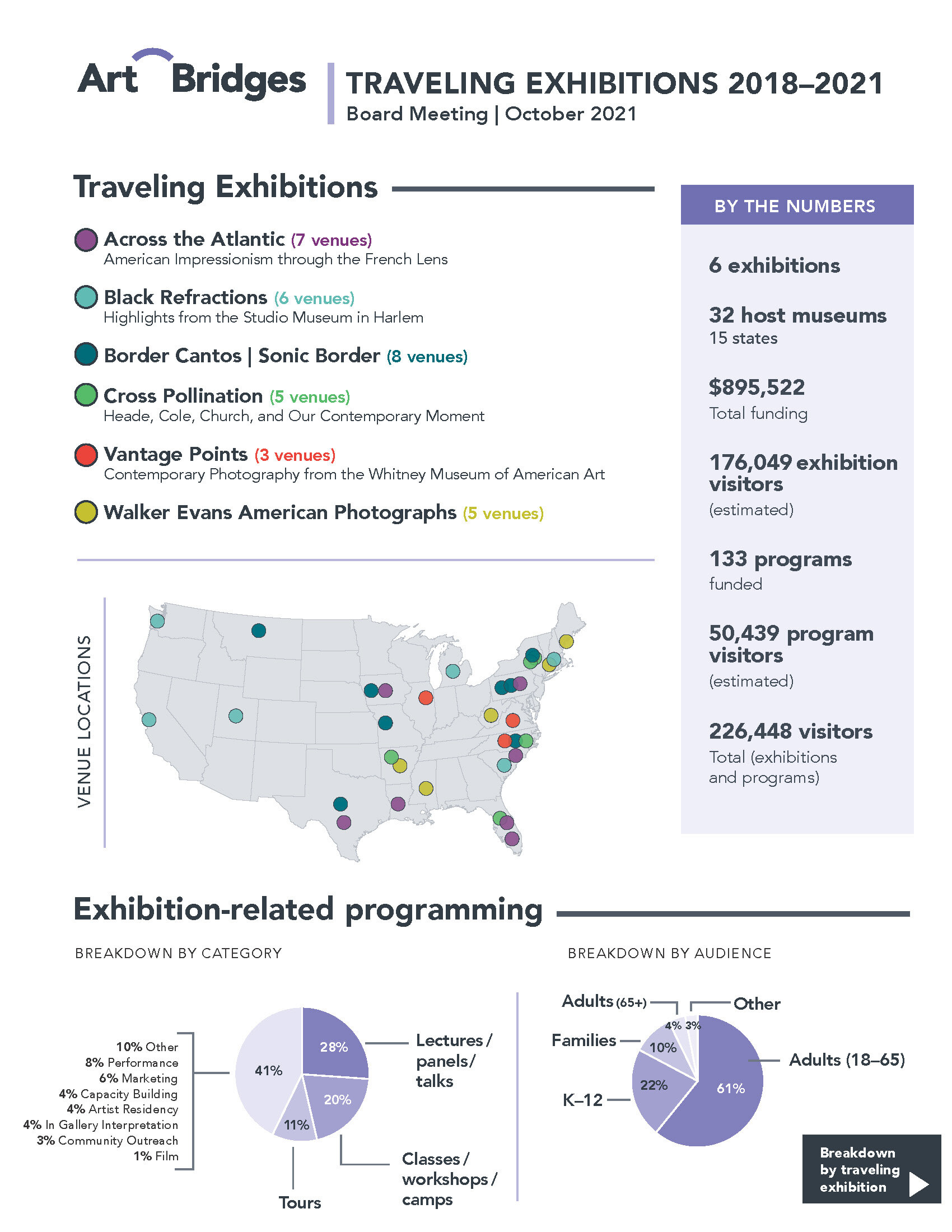
We designed this report for the Art Bridges Foundation—an organization that supports small art museums around the country—to add to their collections and put on impressive exhibitions for their audiences. The report shows the six traveling exhibitions that they funded in the past 3 years. A few examples are shown here with what the content looked like when we received it compared with the final design we produced.
One thing we do whenever designing reports is to wrap our minds around the big picture. What is the main point of this document? What basic information would a reader need to know before diving into the details? Often our clients leave this out of their initial drafts, because to them, the content is very familiar and obvious. To an outsider, however, that’s not necessarily the case.
In this example, we noticed that there was a missing ‘big picture’ view of what the report is about – namely, the 6 traveling exhibitions. So we put the exhibition names, along with basic info about them, up top and BIG on the first page. This also gave us the opportunity to color code the exhibitions, so that color coding can appear throughout the report, on the map, and on the second page that shows more details on each exhibition.
We also visualized some of the data as pie charts, and worked on hierarchy and formatting to make the document easy to scan through and read.


