Food is Medicine
One-pager
We had the opportunity to collaborate with Community Servings and the Center for Health Law and Policy Innovation at Harvard University on a one-page visual summary of the recommendations section of the Food is Medicine Massachusetts State Plan. Once they developed a strategy of increasing access to FIM, they had the challenge of how to communicate it in a simple and approachable way to their audience.
We worked with them to create a one-page visual summary of their “Roadmap for Change”, which includes five distinct steps. To create this graphic, we talked with them about their ideas, read the full “Recommendations” section of the report, and synthesized all of that information into this one pager.
We were thrilled that the one pager was featured prominently in the launch of the plan and in some of the media coverage.
See more about our process below!
Our Process
Step 2—Visualize
The next step is taking the organized information and figuring out what aspects of it can be visualized, what text should remain, and how those visuals and text blocks should be laid out to best reflect the main messages. In this case, we are showing a series of steps of a process, so it made sense to have a directionality to the structure, one step leading to the next. The series of steps isn’t precisely linear (there are feedback loops) so we had to figure out how to represent all of that without it looking too busy or overwhelming. The fifth and last step doesn’t necessarily come at the end, so we chose to put it at the bottom, spanning the others.
Our Process
step 1—Organize
Our first step was to read the applicable section of the report, discuss the concepts with our clients, and then organize the information in a structure that will inform the layout of the one-pager.
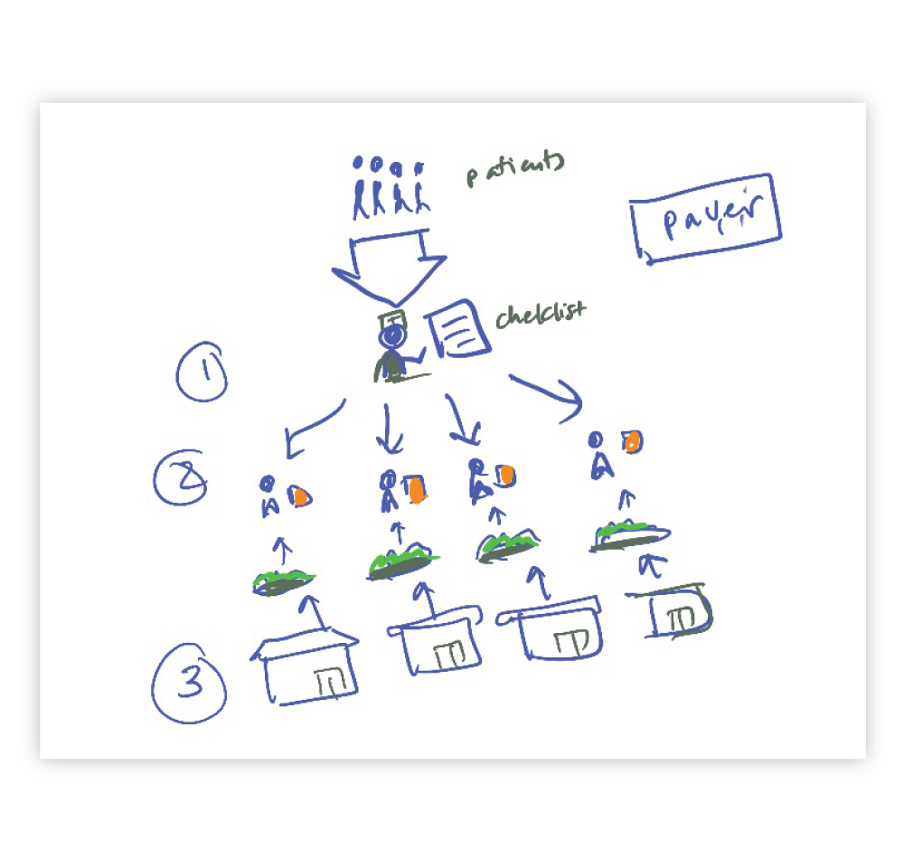
This sketch that shows our process of figuring out how many sections there should be, what the relationship between the sections should be, and what information should go in which sections.

Our Process
Step 3—Stylize
When we get to Step 3, we know the basics of how our layout is organized and the visuals we are using. Now we make sure everything is stylistically consistent, all the colors, typography and layout tweaks are perfect. In this case it involved creating and customizing illustrations with input from our clients, finalizing all the copy with help from our clients, and fine-tuning the layout so the information is clear.


