Creating spaces that inspire visitors
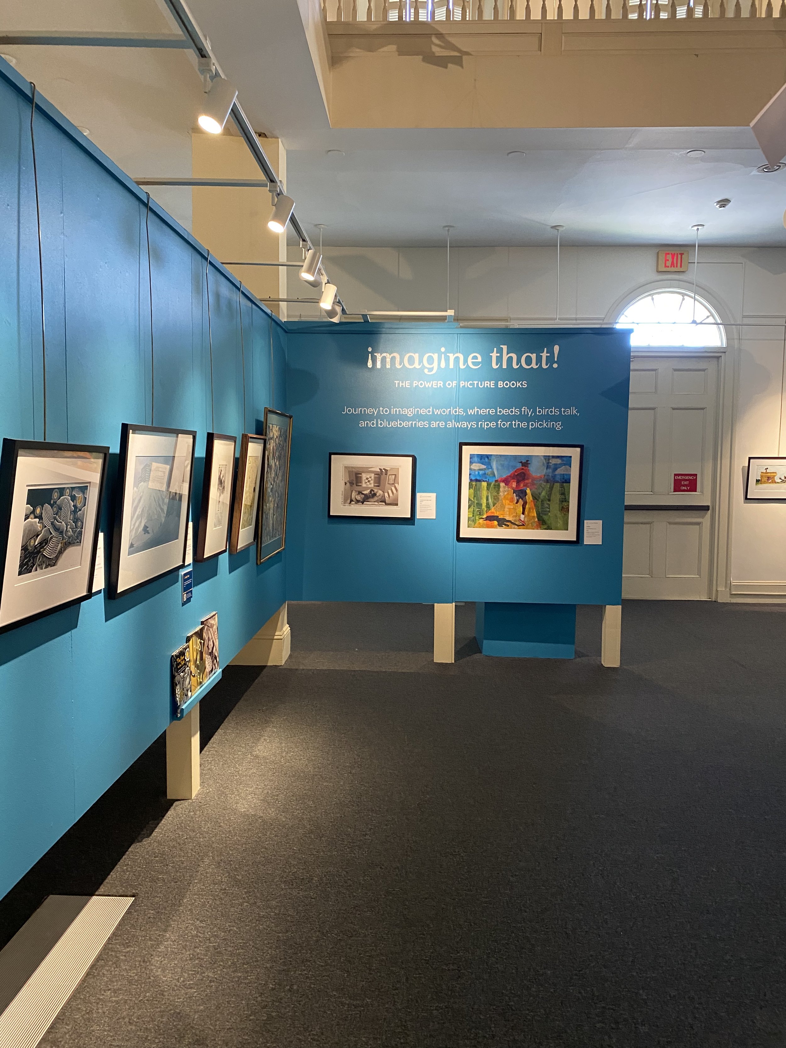
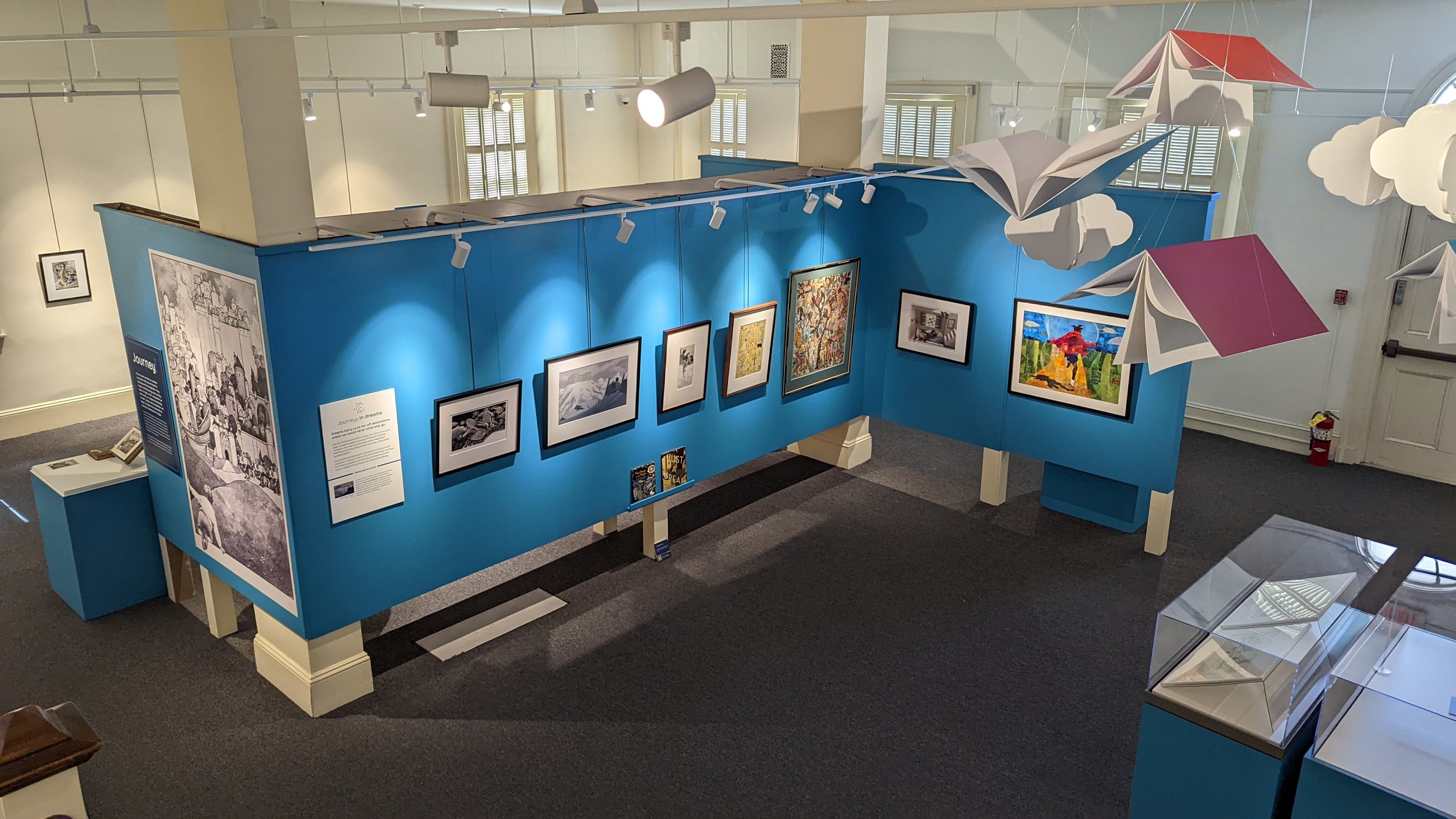
We had the pleasure of working with The Portsmouth Historical Society on their Imagine That! The Power of Picture Books exhibition. This 4200+ square foot exhibition is full of original artwork from children’s book illustrators around New England. This project allowed us to use our expertise in content organization and visualization as well as our love for creating spaces that inspire visitors. On exhibition through September!
Learn more about our process below!
Visual Process Documents
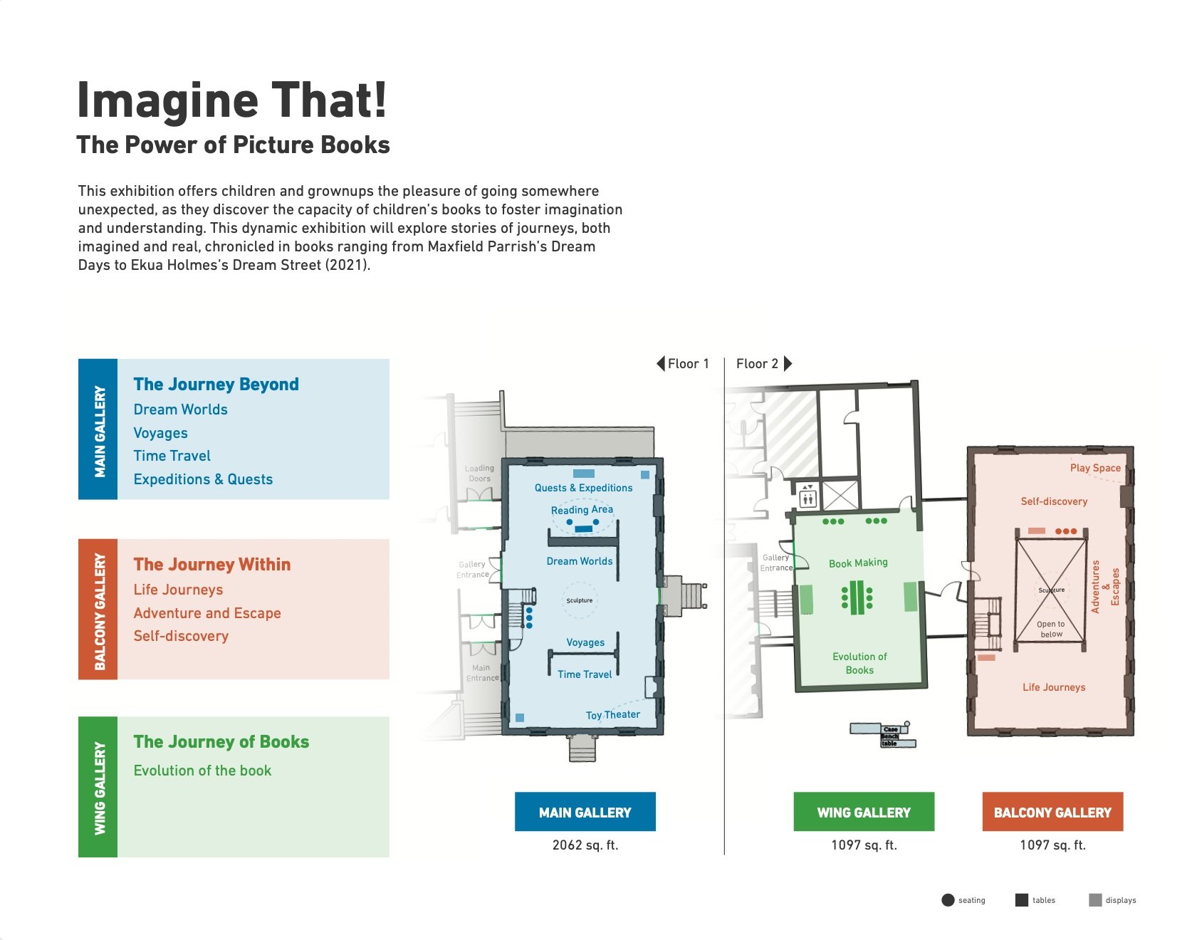
Whenever we tackle an environmental design project like exhibitions, schools, building interiors, etc., we like to create a visual organizer to orient the team on all the project components. We typically use the floorplan as the central visual and enhance it with color-coding, labeling, imagery, and lists to make sure all elements are represented and in their designated area. These visual organizers are working documents that evolve as the project progresses.
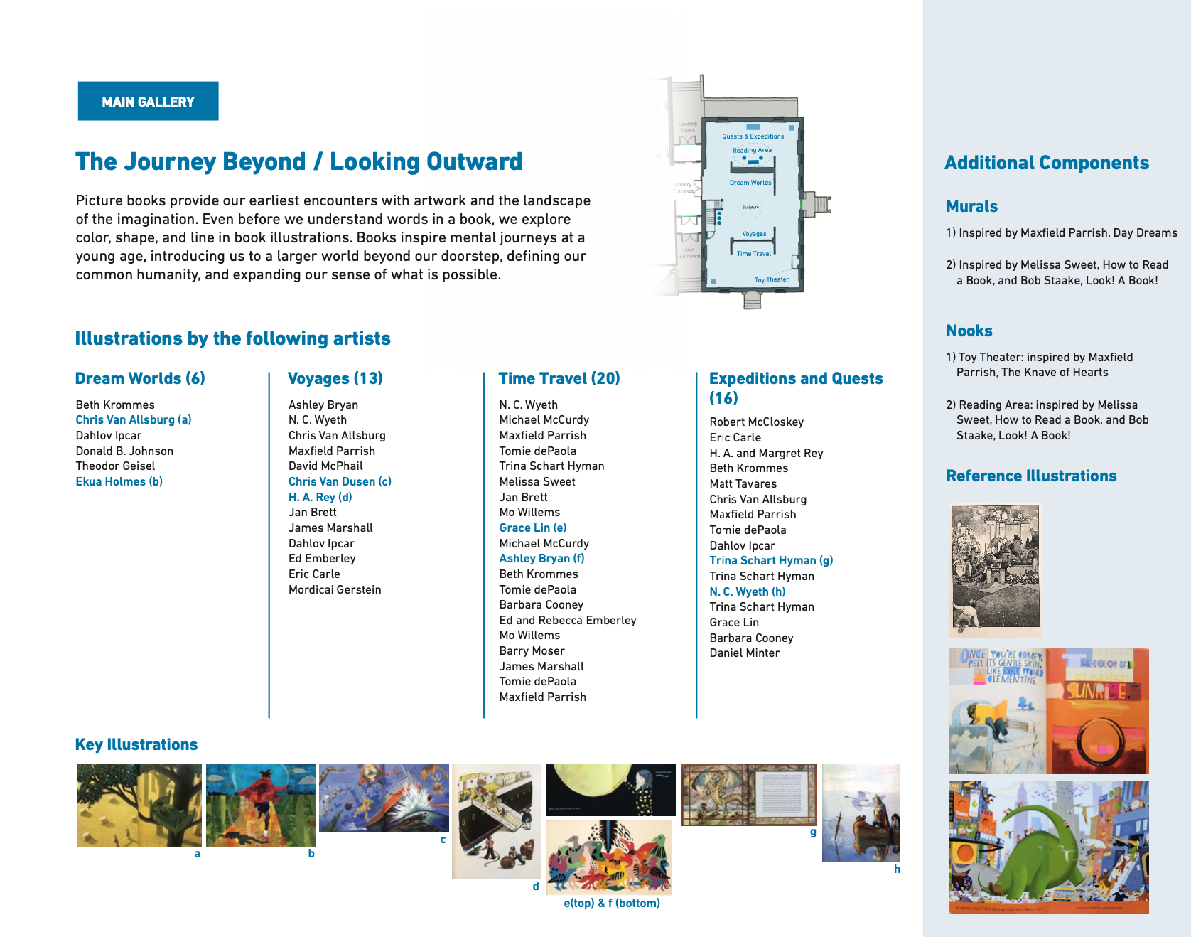
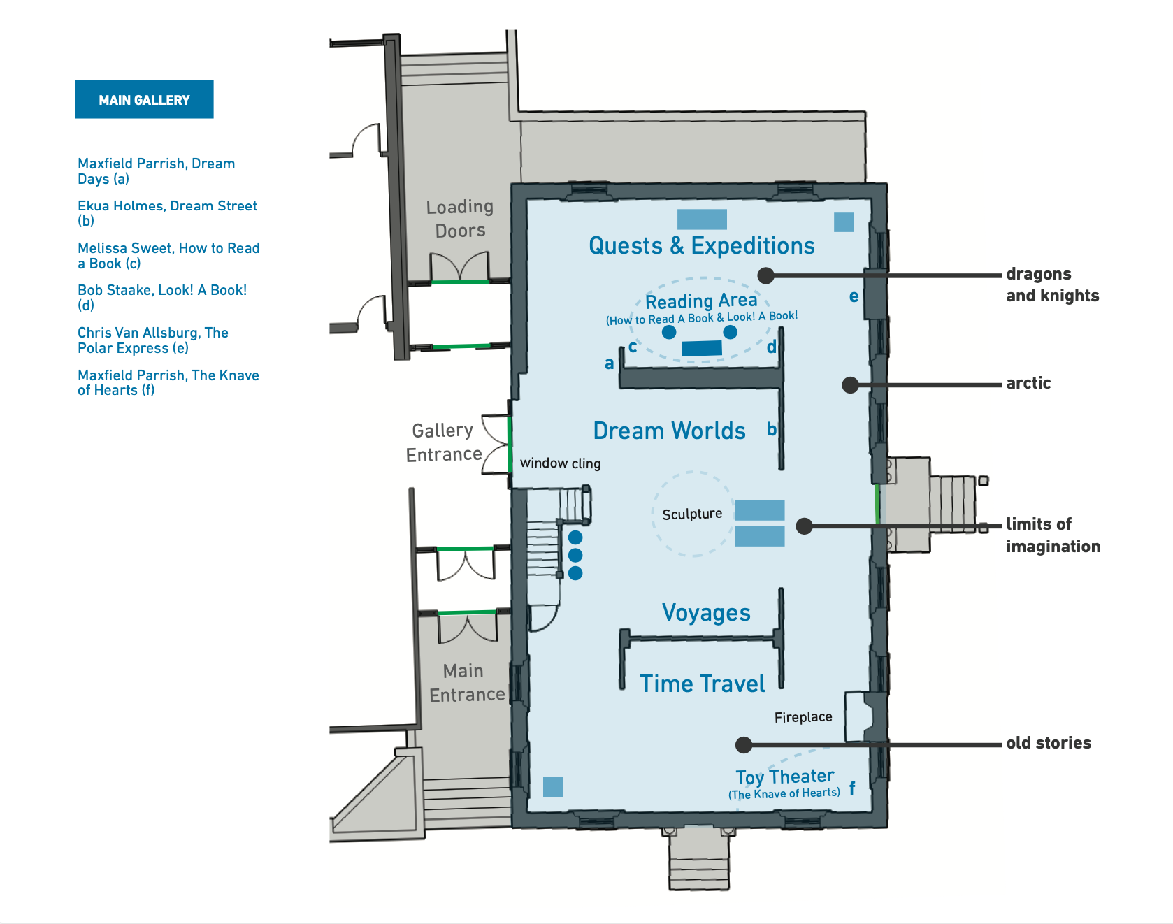
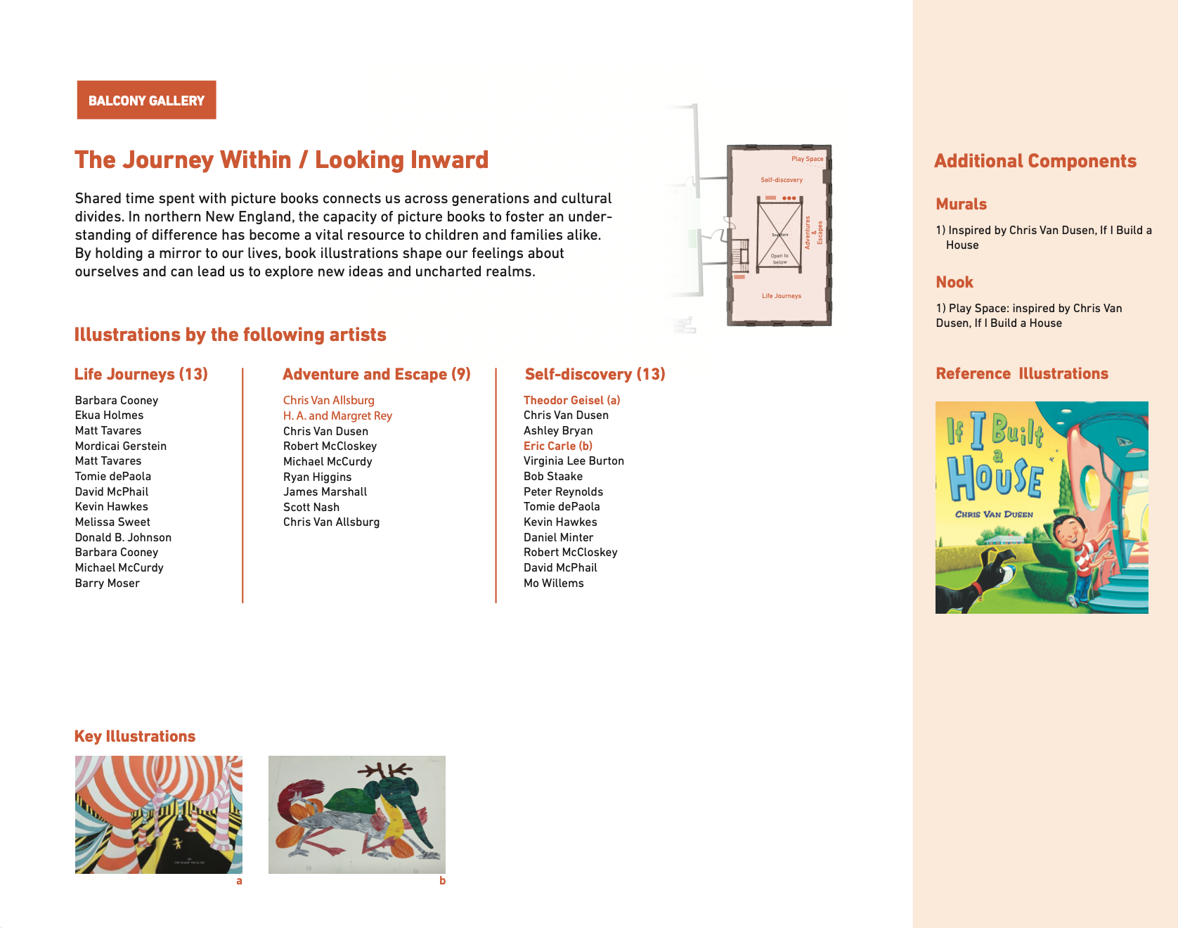
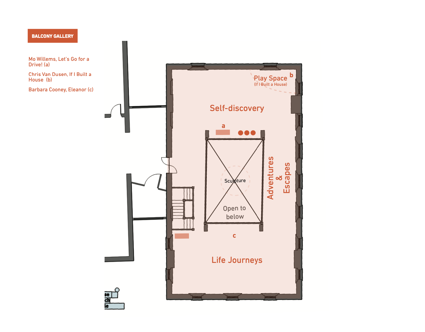
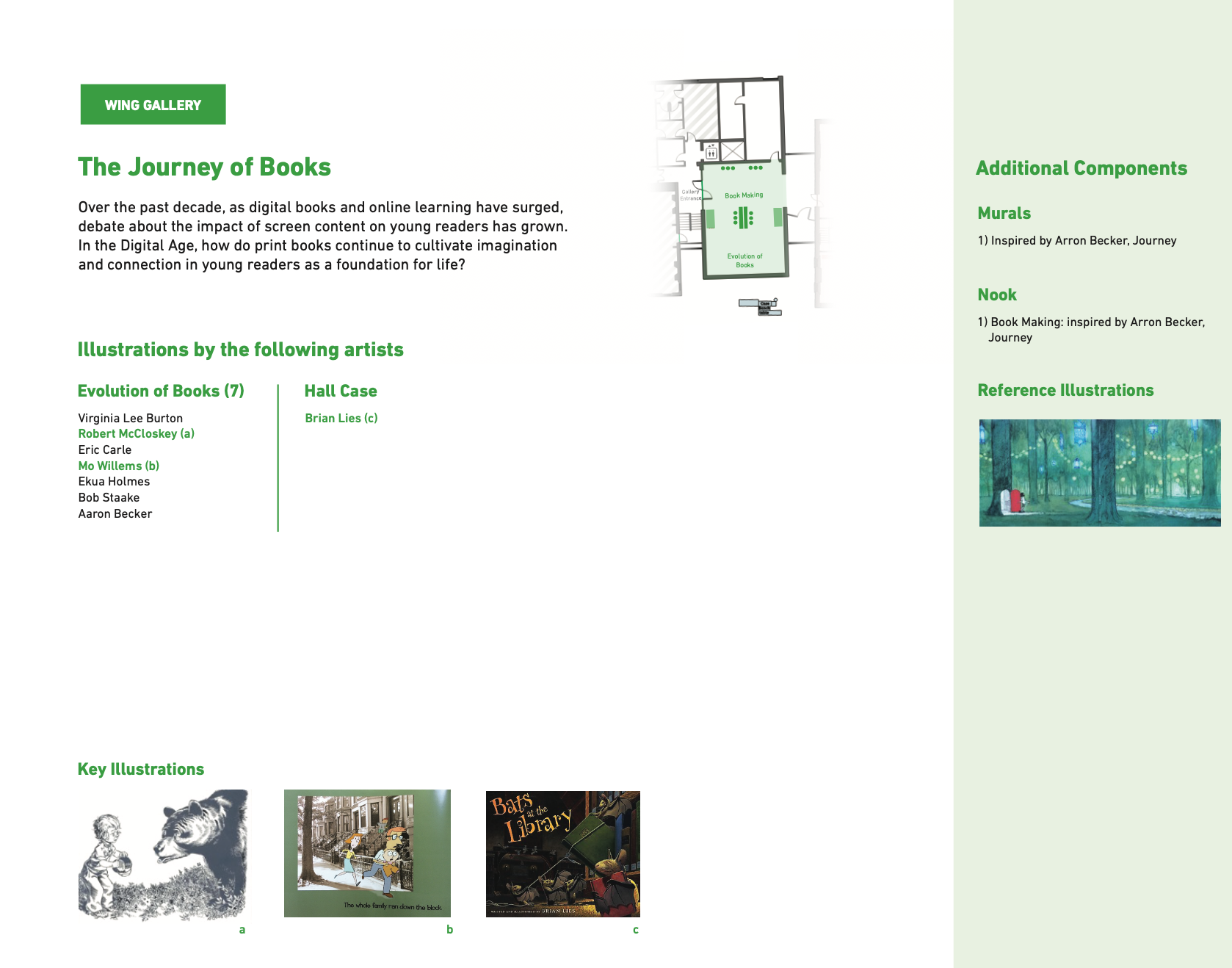
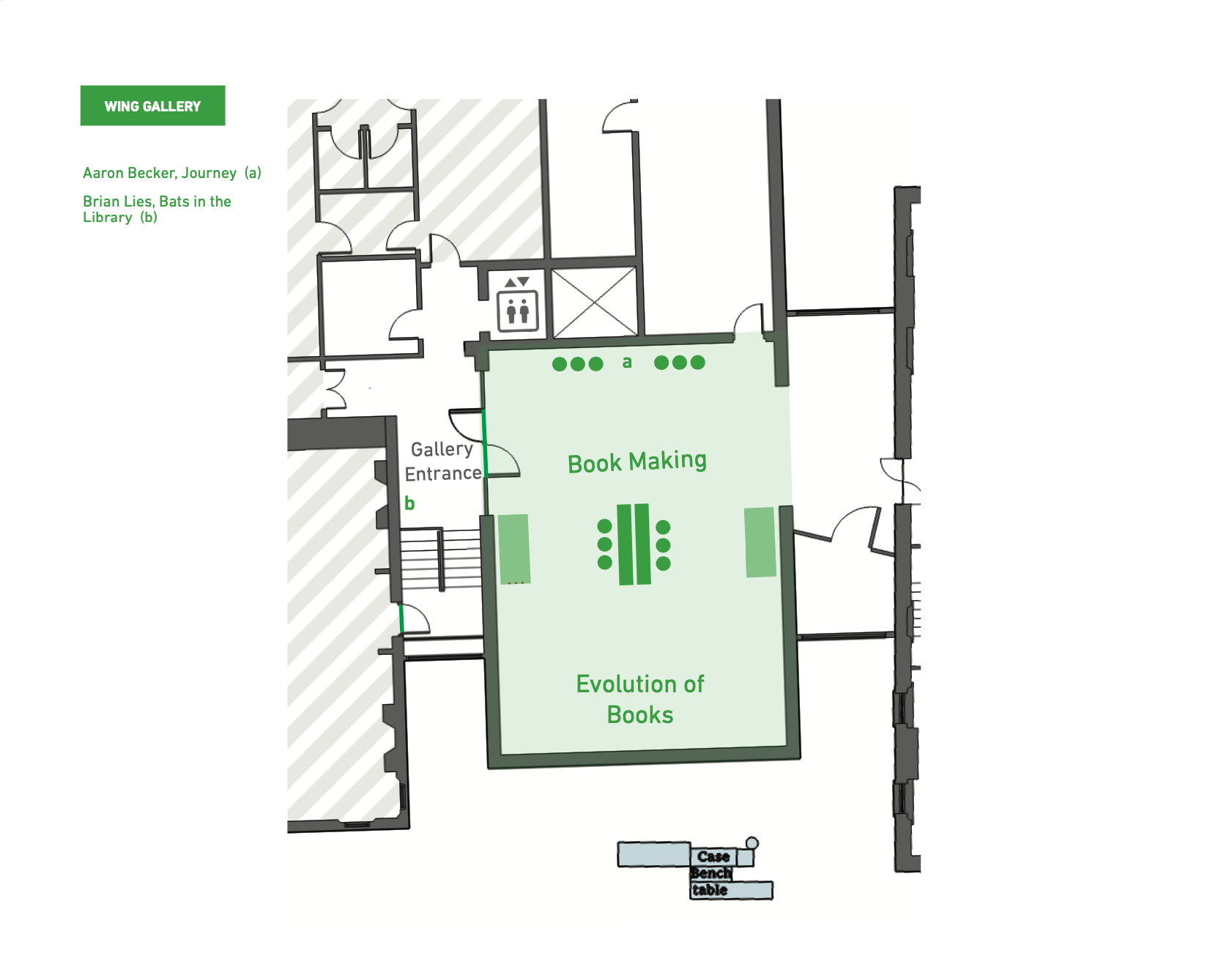
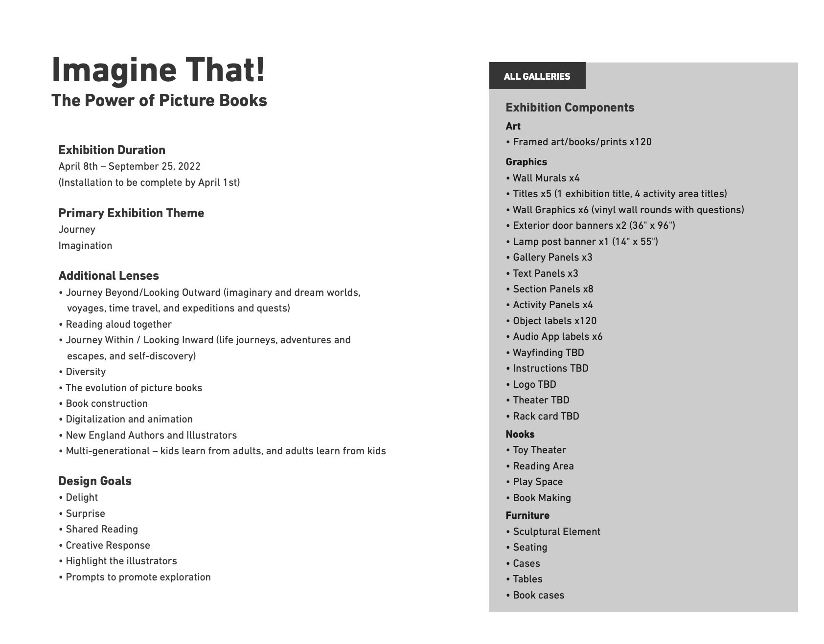

Exhibitions sections, colors, and Icons
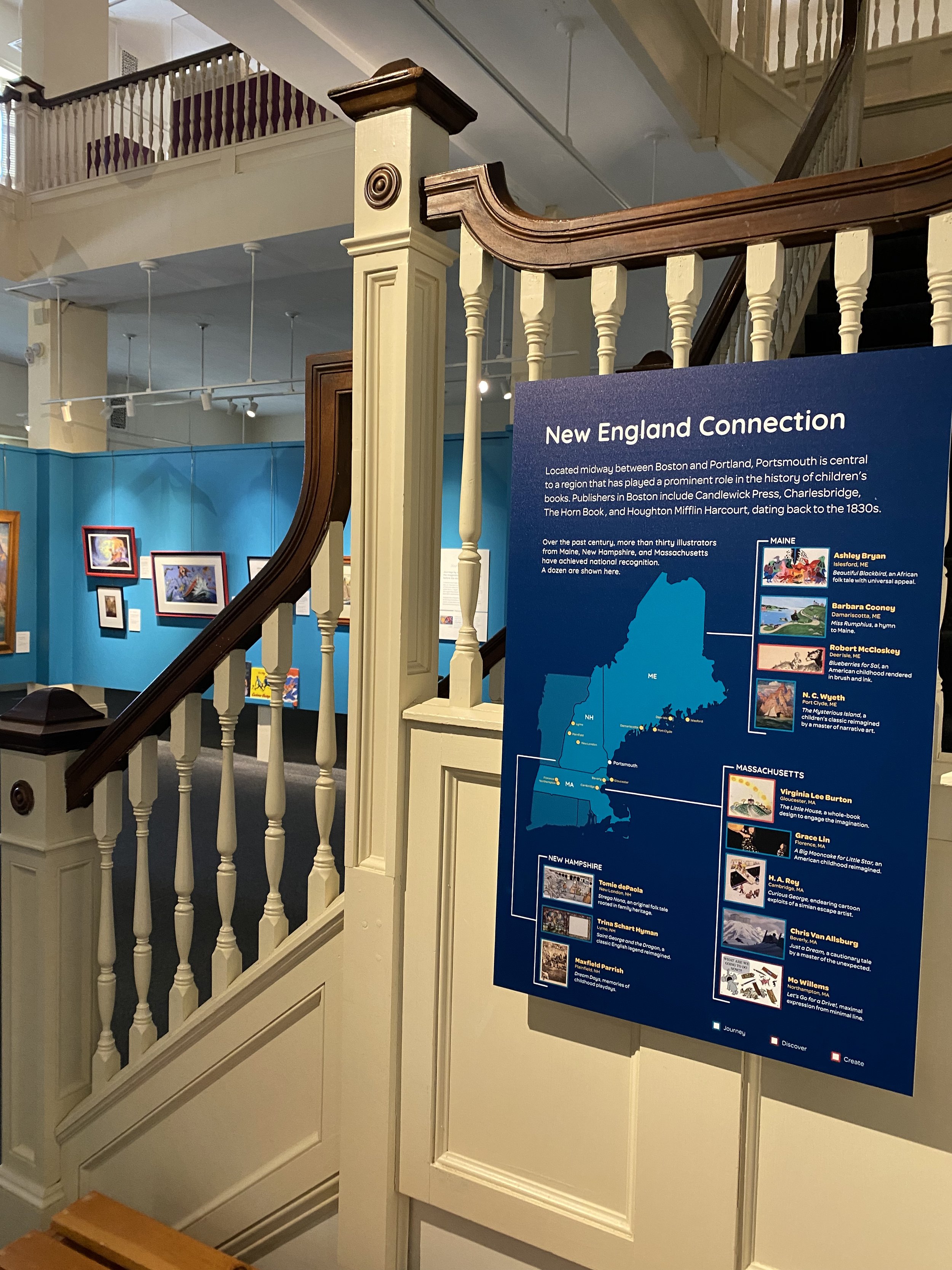
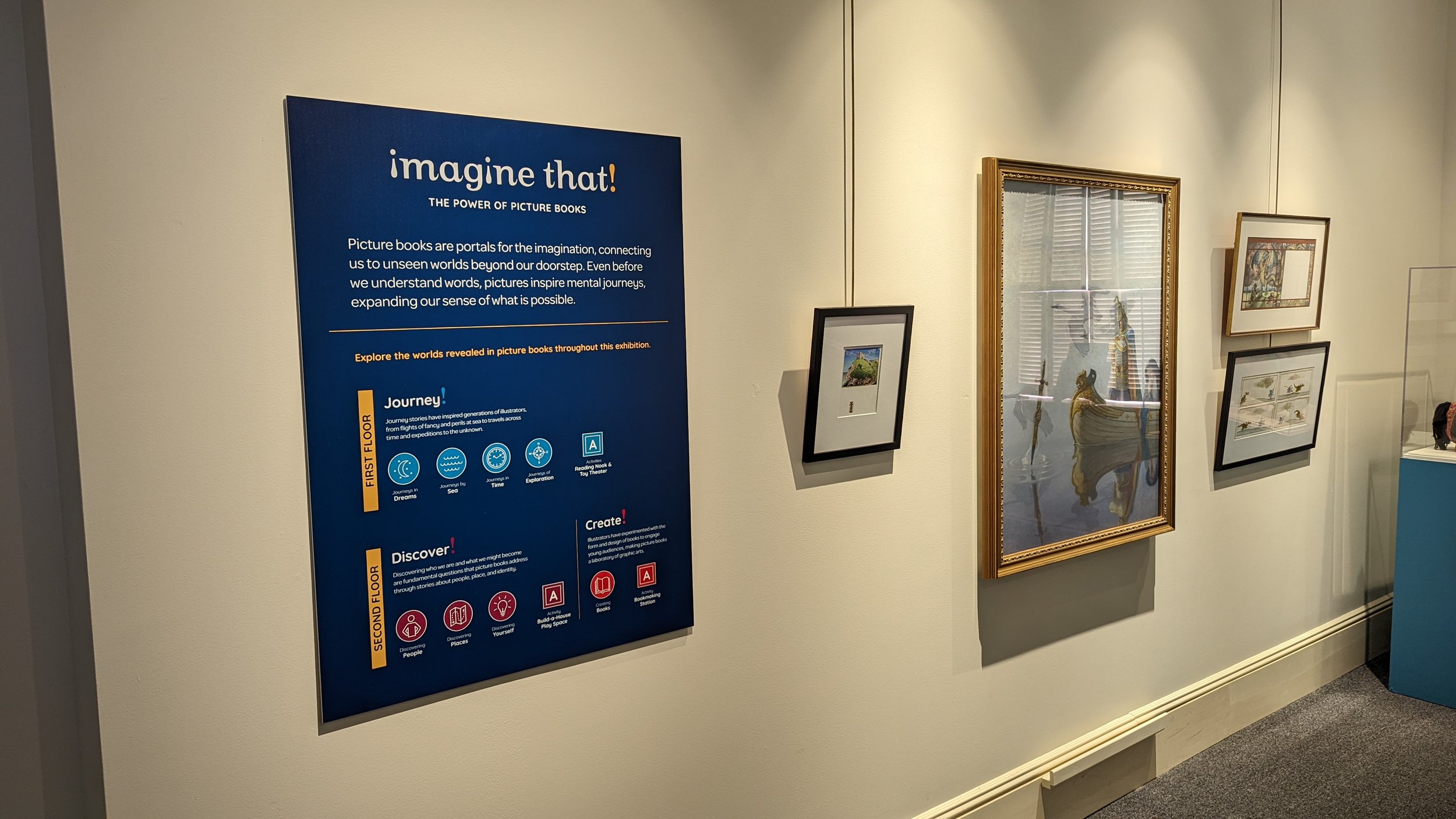
We worked closely with the exhibition team to create a hierarchy for the graphics. We did this by writing approachable titles, color-coding sections, and designing icons. We created an orientation panel that’s placed on both levels of the exhibition for visitors to get familiar with what they’ll be experiencing in the exhibition.
Orientation panel
Label design
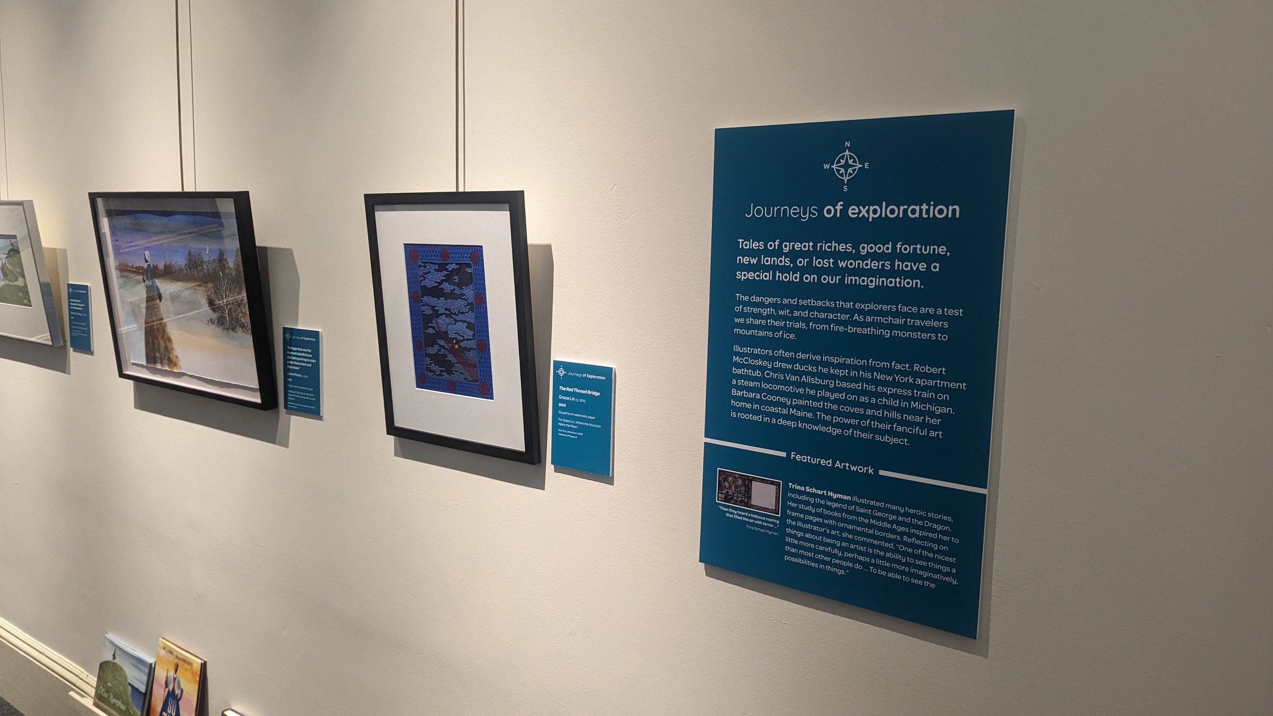
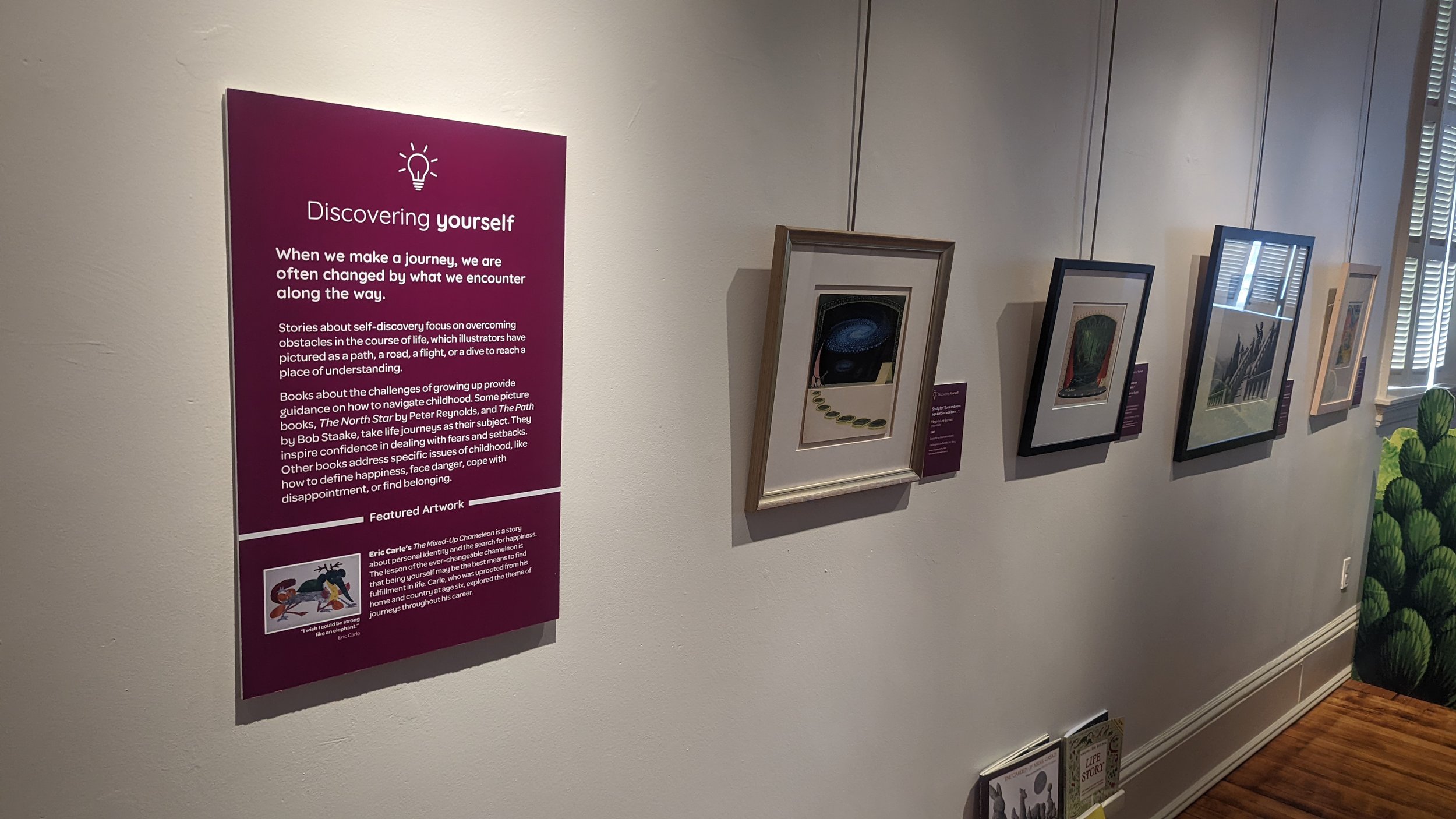
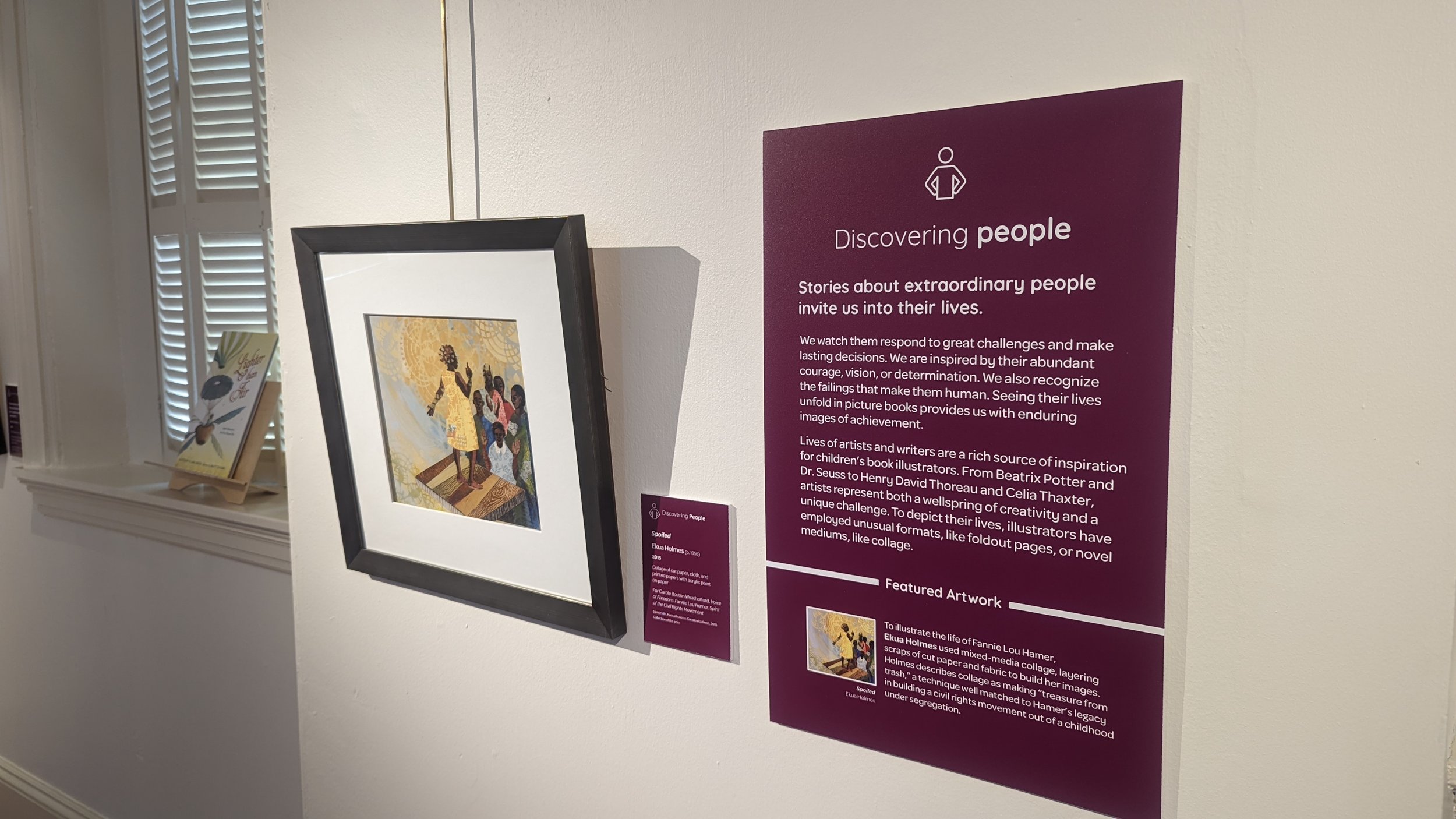
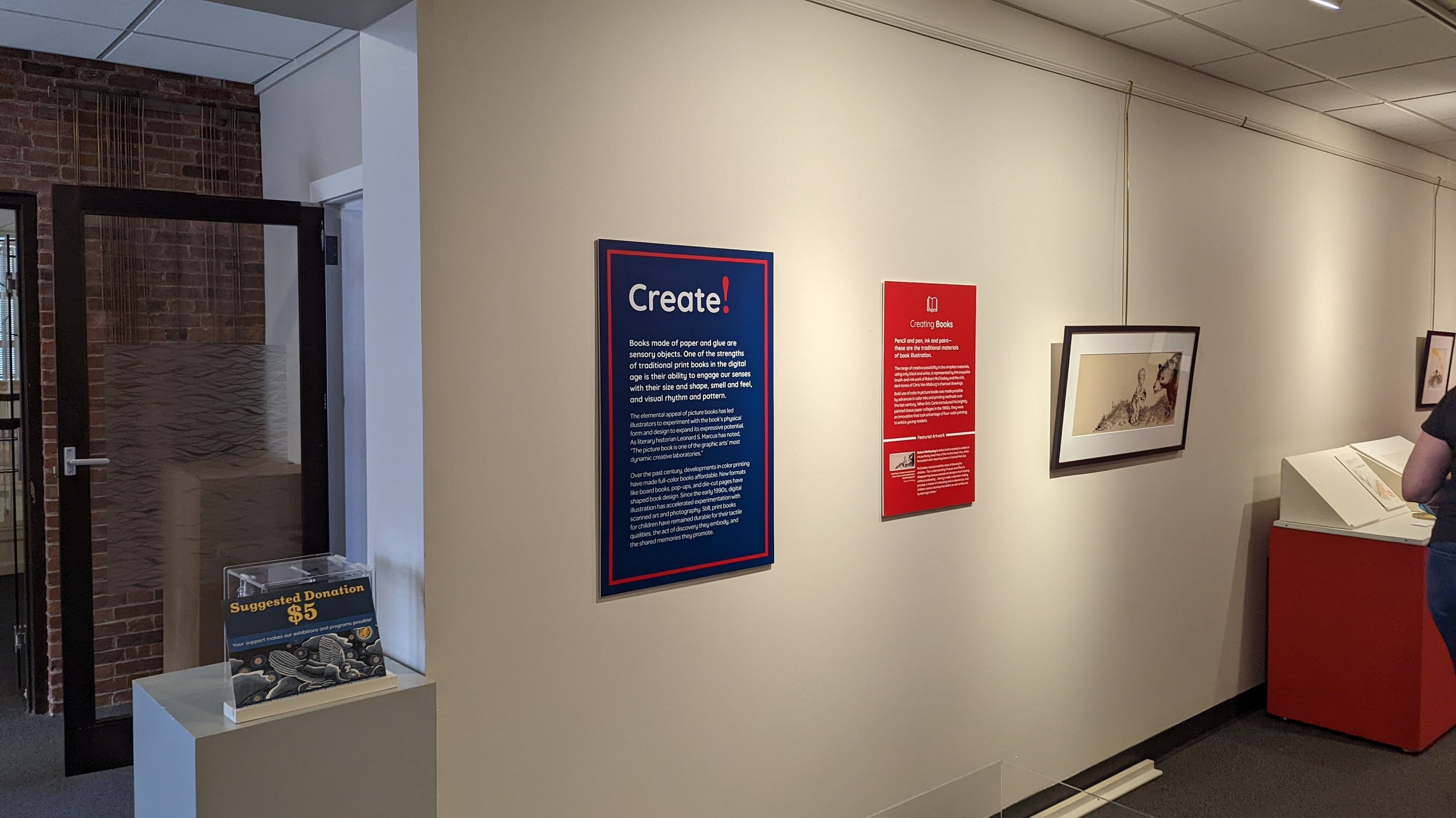
We used four primary label types to provide a consistent flow throughout the exhibition. These labels are text-heavy, but they use a friendly and legible font and are structured to highlight key content. We used icons and color-coding to orient visitors at a glance.
Exhibition Labels
One of four exhibition labels
Area Labels
One of three area labels
Section Labels
One of eight section labels
Object labels
One of 128 object labels
Environmental elements
The exhibition team wanted the space to feel friendly, playful and welcoming to all visitors—especially kids and families—without taking focus away from the stunning original art in the exhibition. To that end, they identified four areas to add 3D elements, which we had to the opportunity to help design.
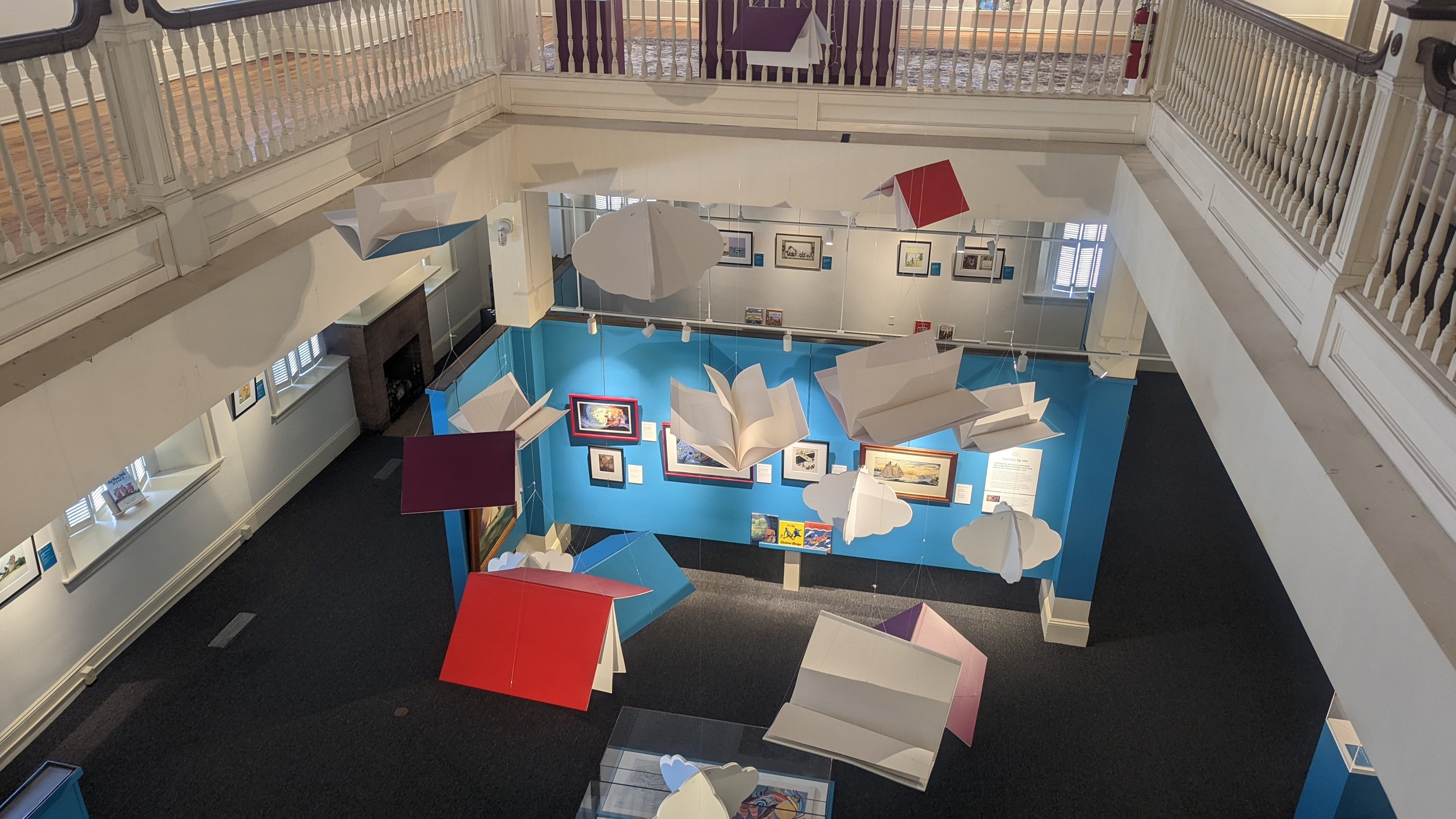
The suspended book sculpture in the center of the exhibition
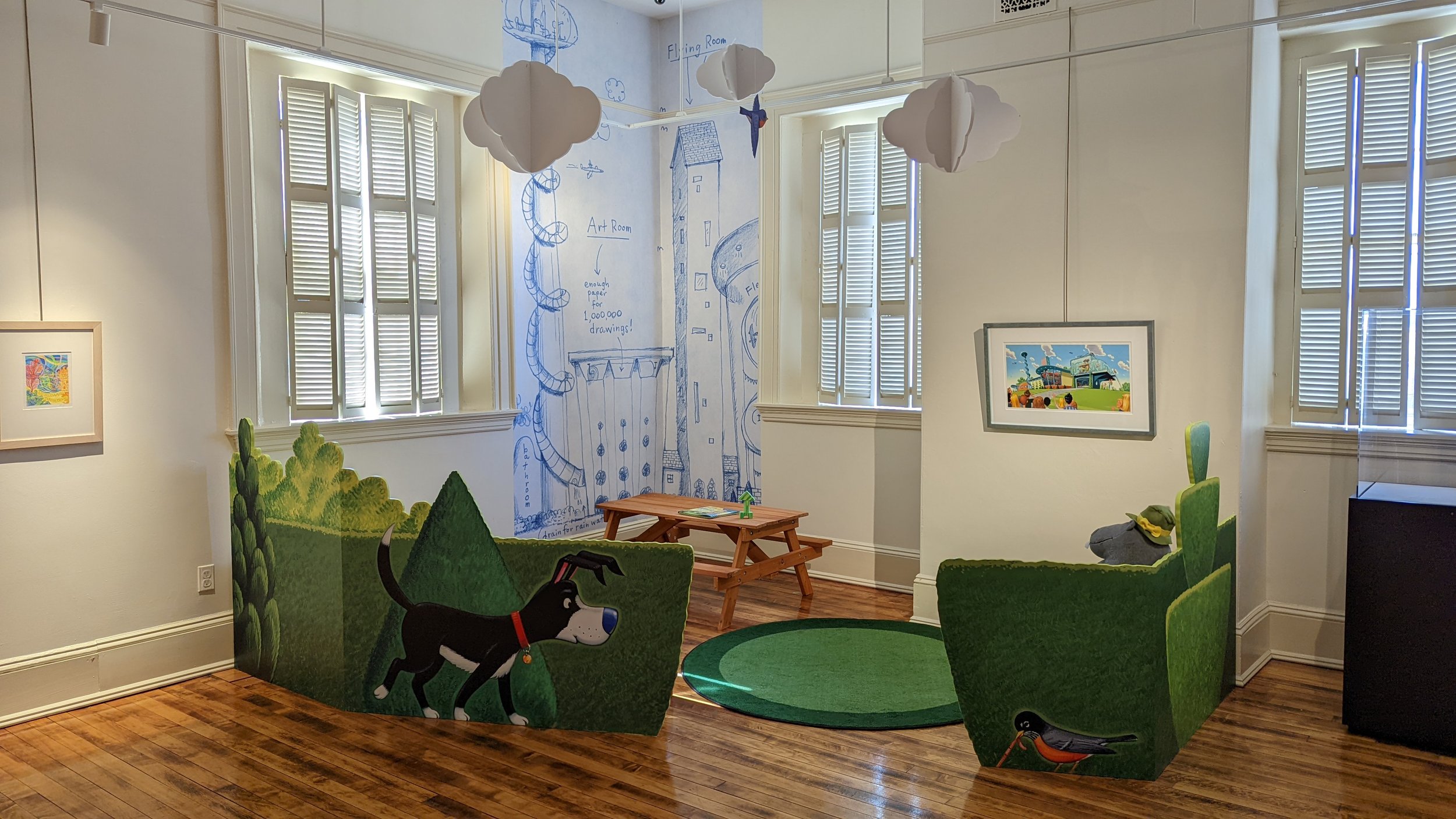
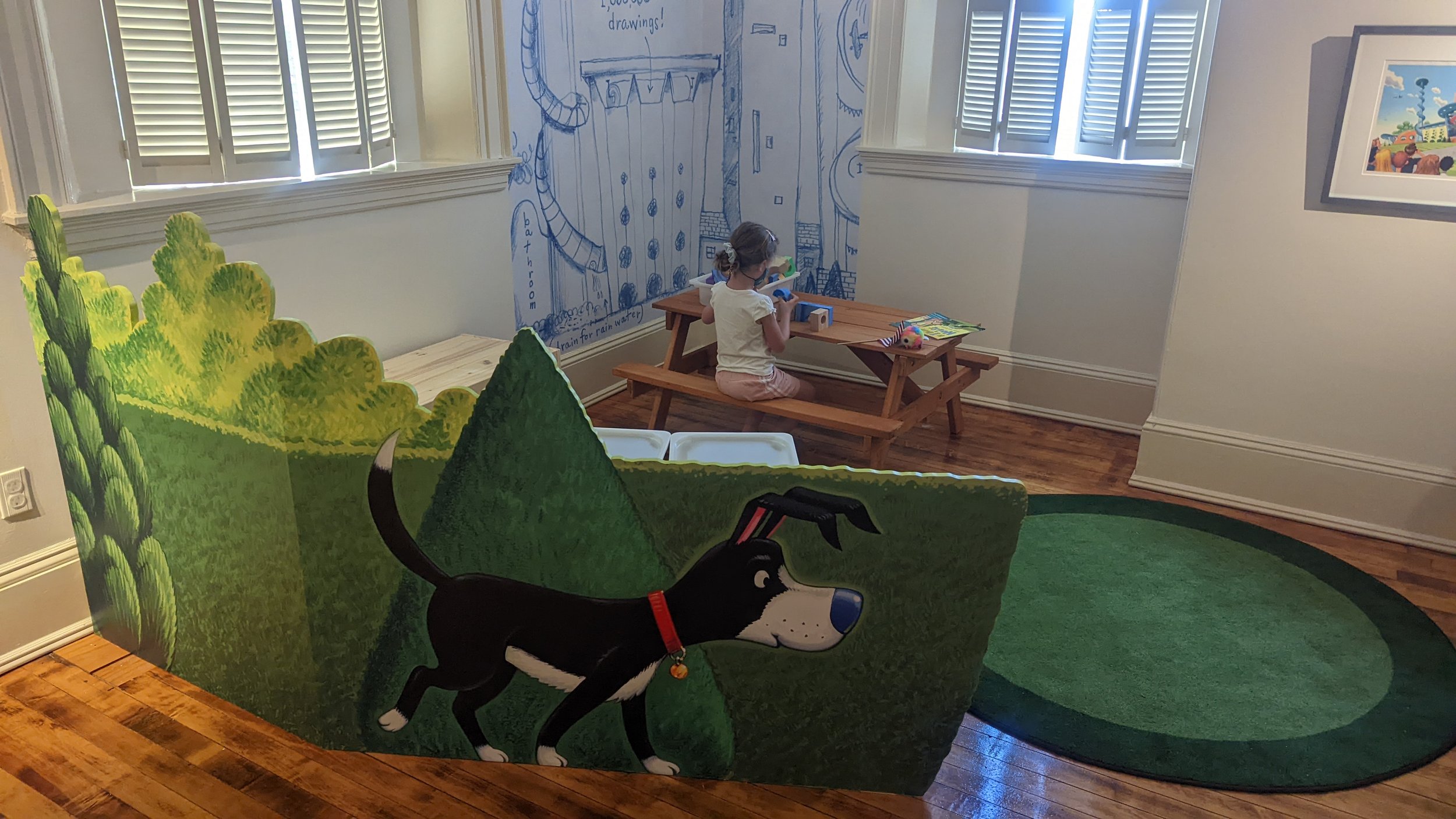
The play area that included original artwork by Chris Van Dusen
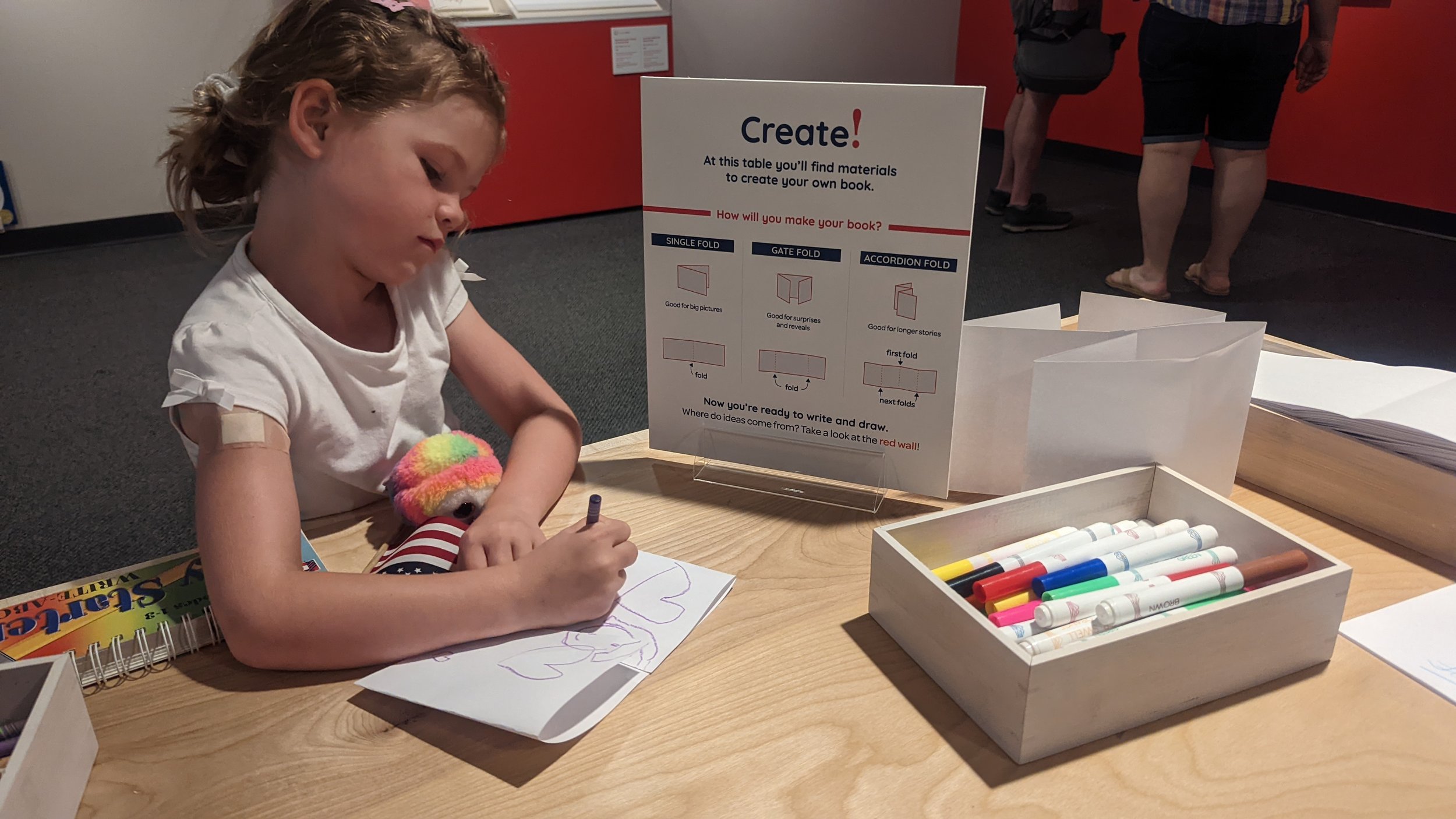
The book-making station
The reading nook
the book sculpture
We worked with fabricator Will Twombly on this whimsical sculpture. We brainstormed concepts, fine-tuned our ideas, and provided details on how the sculpture should look in its final state.
Drawings and Specifications
the Play Space
We wanted to create a unique area for kids. We reached out to Chris Van Dusen to see if he could provide us with assets from his book If I Built A House, and he generously offered to create original assets for the low divider walls. We provided him with examples of bushes we liked from his book and the dimensions we needed the drawings to be. His original art was then scanned, resized, printed, and fabricated for this final design.
Drawings and Specifications

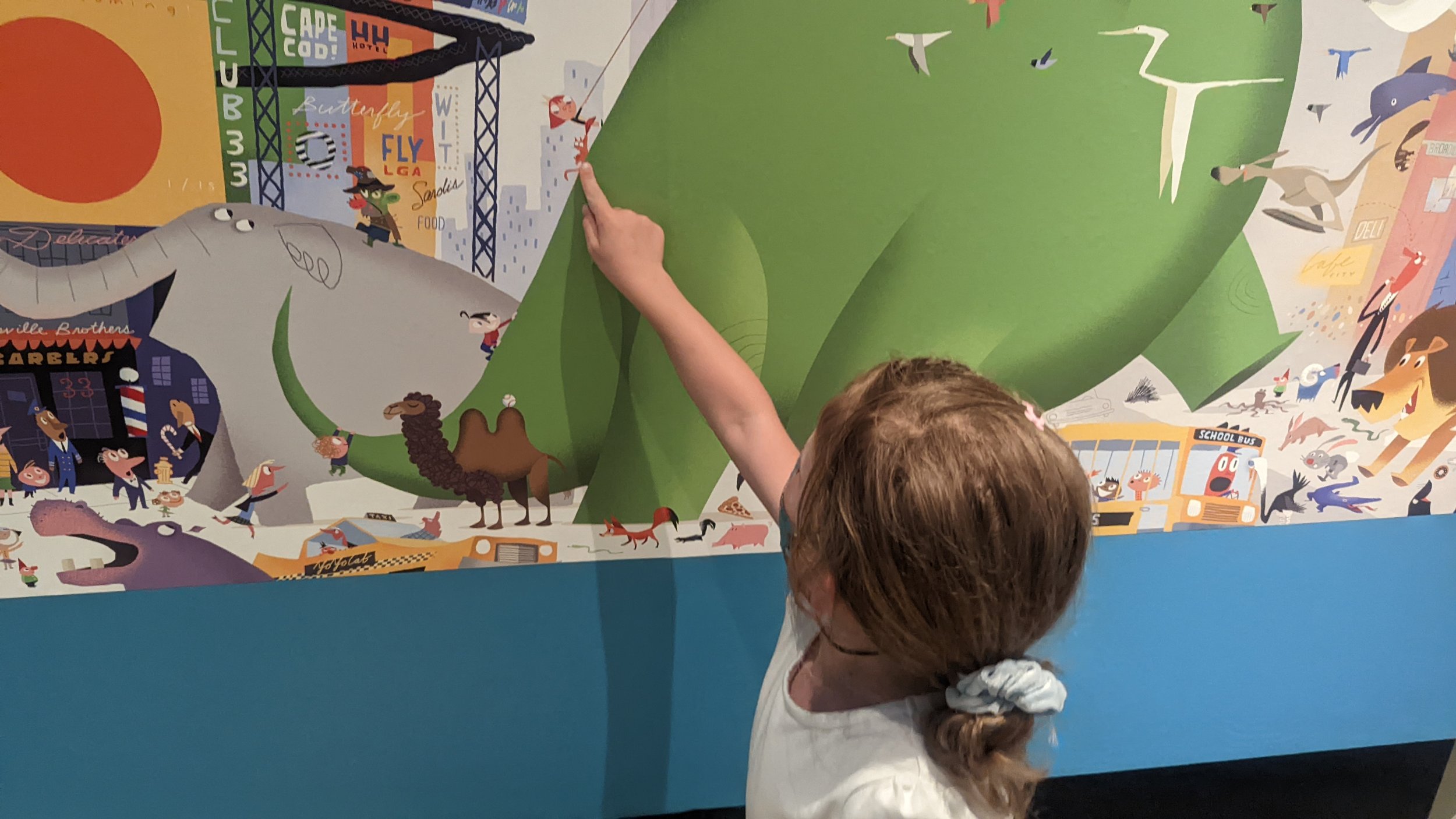
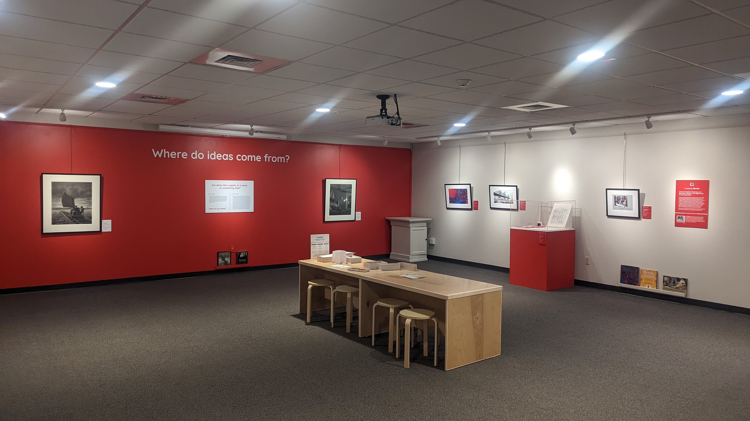
THe final exhibition
Before and Afters


